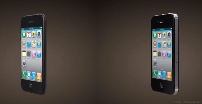
An iPhone 5 mockup shows what the iPhone 4S should have looked like
According to its creators, what you see below is what the new iPhone 5 will look like. The beautifully looking render is made with a few reasonable points in mind. It has the same screen resolution as the iPhone 4/4S to save iOS some effort, a thinner body and a smaller connector.

Now judging by all those rumors, it’s all but guaranteed that the new iPhone will have a larger 16:9 screen, so chances are the guys from 3d-desk didn’t get it quite right. However you can’t deny that this is what the iPhone 4S should have looked like. By altering just a few elements (so it wouldn’t have increased production costs too greatly), this design still looks different enough to be easily recognizable and is cool enough to be worthy of a flagship smartphone.
Want to see it in action? Just check out the video below to get a feel of how the iPhone 4S could and should have been like.
We don’t know about you, but we wouldn’t mind seeing a similar dark frame and smaller logo on the real iPhone 5. Come on, Apple – at least think about it.
Featured
Categories
- Mobile phones
- Mobile software
- Mobile computers
- Rumors
- Fun stuff
- Various
- Android
- Desktop software
- Featured
- Misc gadgets
- Gaming
- Digital cameras
- Tablets
- iOS
- Desktop computers
- Windows Phone
- GSMArena
com - Online Services
- Mobile Services
- Smart Watches
- Battery tests
- BlackBerry
- Social Networks
- Web Browsers
- Portable Players
- Network Operators
- CDMA
- Windows
- Headphones
- Hands-on
 Oppo R1x battery life test
 Lenovo A7000 Preview
 HTC One E9+ performance benchmarks
 Your verdict on Android M, iOS 9 and Watch OS 2.0
 Xiaomi Mi 4i battery life test
Comments
Rules for posting