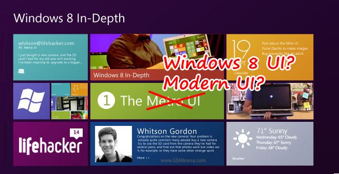
‘Metro UI’ name dropped in favor of ‘Windows 8 UI’, or is it ‘Modern UI’?
The term “Metro”, describing Microsoft’s new user interface design gained popularity starting with Windows Phone 7 after its Zune HD beginnings. It really grew into prominence when it became the UI style for Windows 8 and now, not long before its scheduled late October launch date, Microsoft renamed it.

A leaked memo was the first sign that the name “Metro” is on the way out, supposedly due to copyright concerns. “Windows 8 style interface” was suggested as a replacement, but Microsoft may have settled on a simpler name.
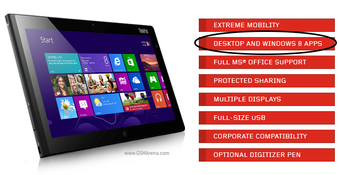
Mary Jo Foley now writes that Microsoft is going with just “Windows 8 interface” (dropping the ‘style’), with ‘desktop’ being thrown in when we’re talking about old-school Windows apps.
For example, here’s how Lenovo’s promo material for the Windows 8-running ThinkPad Tablet 2 describes it:

Of course, the new terminology will be carried over to Windows Phone. But it’s going to be awkward – Windows 8 interface on Windows Phone 7.8 sounds like an oxymoron. It’s worse for the Xbox, whose OS isn’t any form of Windows.
The Verge is telling a different story. According to them, Microsoft employees have taken to calling the no-longer-Metro interface “Modern UI”. There’s a list of Microsoft.com pages for planned events that also use “Modern UI”, including the gem “Modern UI-style UI“.
The origin of “Modern” may not be new, this page posted in late May says the following: “A Metro style app that runs in the Windows 8 Release Preview modern shell…”.
Either way, Metro had really taken root, even if it was just a codename for the interface. Changing it to Windows 8 UI or even Modern UI will need increased effort to rebrand the interface (people will probably keep calling it Metro for quite a while) and will lead to some awkward phrasing.
Featured
Categories
- Mobile phones
- Mobile software
- Mobile computers
- Rumors
- Fun stuff
- Various
- Android
- Desktop software
- Featured
- Misc gadgets
- Gaming
- Digital cameras
- Tablets
- iOS
- Desktop computers
- Windows Phone
- GSMArena
com - Online Services
- Mobile Services
- Smart Watches
- Battery tests
- BlackBerry
- Social Networks
- Web Browsers
- Portable Players
- Network Operators
- CDMA
- Windows
- Headphones
- Hands-on
 Benchmarking Asus ZenFone 2 ZE551ML with Intel Atom Z3580 SoC and 4GB of RAM
 Your verdict on Android M, iOS 9 and Watch OS 2.0
 Xiaomi Mi 4i battery life test
 Hot or Not: Android M, iOS 9 and Watch OS 2.0
 Samsung Galaxy S6 updated to Android 5.1.1: exploring the differences on video
Comments
Rules for posting