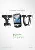
HTC makes a switch in brand identity, it’s up to YOU now
Today HTC launched their brand redesign choosing “Quietly Brilliant” as a slogan in favor of their old “HTC Innovation”. The new HTC brand identity is more easy-going with light-colored backgrounds and handwritten fonts. The thing that I enjoy the most is that their once pitch-black film-noir website color scheme is redesigned as well with a more lively feel in mind. I would have liked it even better if they went for something more colorful instead of simply switching from black to white overnight, but I’ll take it as it is.

HTC will use the new “Quietly Brilliant” brand message as a part of their world-wide advertising campaign that puts “YOU” (the user) in the center of the advertising message. The slogan in all marketing materials will be something along the lines of “You don’t need to get a phone. You need a phone that gets you.”
Here, you can watch one of their new videos:
Most of HTC key messages as well as quite a few of their new graphics are actually doodles. Doodles are those tiny drawing we sometimes make while our minds are onto something else – such as while we’re on the phone, for instance. Oh, there you go – it’s all about those phones, right? No, it’s about their phones, and what they can do for you. It’s also about how those phones and their brand make you feel.

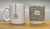
HTC are reminding us that many of the life’s most brilliant things begin as a humble sketch on the back of a napkin. They sure do send the right message, but will that be the right tone for selling expensive high-tier phones? Well, I guess we’ll see about that.
You can read a little bit more about how they came up with the new ad campaign here.
Featured
 Lenovo A7000 Preview
 Benchmarking Asus ZenFone 2 ZE551ML with Intel Atom Z3580 SoC and 4GB of RAM
 Hot or Not: Android M, iOS 9 and Watch OS 2.0
 Oppo R7 battery life test
 Xiaomi Mi 4i battery life test
Categories
- Mobile phones
- Mobile software
- Mobile computers
- Rumors
- Fun stuff
- Various
- Android
- Desktop software
- Featured
- Misc gadgets
- Gaming
- Digital cameras
- Tablets
- iOS
- Desktop computers
- Windows Phone
- GSMArena
com - Online Services
- Mobile Services
- Smart Watches
- Battery tests
- BlackBerry
- Social Networks
- Web Browsers
- Portable Players
- Network Operators
- CDMA
- Windows
- Headphones
- Hands-on
Comments
Rules for posting