Android L release: Flashing at first sight
The Android L release is Google’s new look for the operating system since Holo. It features a new design language called Material Design which is far more than a fresh coat of paint for the most popular mobile operating system out there.
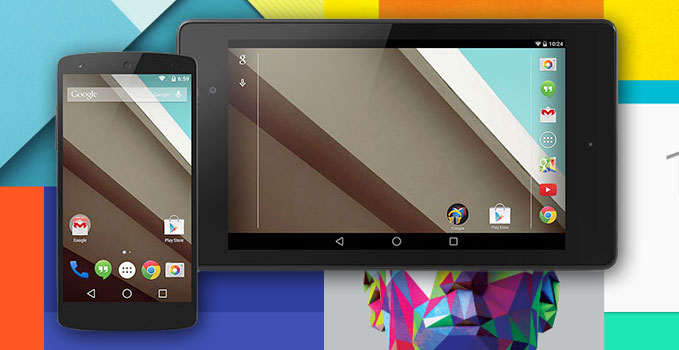
Hidden behind the “L release” moniker probably sits the Android 5.0 version number, which will carry a desert name starting with L. But that’s not important, really, as the “L release” brings a lot of new things to the table, both inside and out.
In fact, the release is so huge, that Google gives developers several month to update their apps to be in line with its look and feel. The L-release will launch in the Fall, but the company made a developer preview available for the Nexus 5 and Nexus 7. Naturally, we were all over it to see what’s new.
The next version of Android adopts Google’s new design language called Material Design. Inspired by real-world materials, the UI design gives users the feeling they are not in touch with lifeless shapes and colors, but with an environment that reacts to their interactions.
After successful flashing of the developer preview image file onto the Nexus 5, you’re greeted with a refreshed Android-logo boot animation. Check it out below.

Once the L release boots and gets ready to go, the new lockscreen panel comes with some new additions. The clock and date widget still take the center of the screen, but below it the unlock ring is no more. Unlocking the phone is done by a swipe up towards the notification drawer.
In addition to the camera shortcut, you can now quickly access the dialer from the lockscreen, too. This is done with a swipe to the right and proves to be quite convenient so far. Strangely, lockscreen widgets are nowhere to be found, which leads us to think that Google might’ve removed them altogether.
Locking the screen is still accompanied by the familiar (and cool) turn-off effect. When the phone is charging, the lockscreen also displays the estimated time until the phone reaches 100% battery charge.
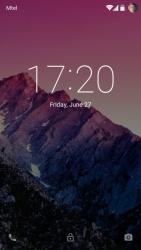
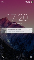
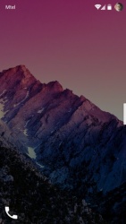
The refreshed lockscreen misses widgets in the L preview
Past the lockscreen, the only new visual difference on the homescreen are the new software keys at the bottom. They’re now far simpler shapes than in previous version of Android and are a left-turned triangle for Back, a circle for Home and a square for the switching between apps.
Stylistically, the bottom and top bars still sport translucent backgrounds. The icons in the status bar remain virtually the same, but according to the Google Design guidelines, they ought to change in the final release.
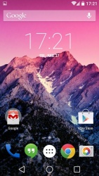
The homescreen is virtually unchanged save for the software navigation keys
Far more interesting visual overhaul is present in the notification drawer. A swipe up reveals the notifications only, while a second swipe reveals the quick settings toggles.
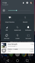
The new notification drawer and quick settings toggles
Notifications now feature a card design and stand out more from one another due to this. On top of them is the status bar which holds the clock on the left and your profile photo in addition to the Wi-Fi, signal and battery icons on the right.
You can also click anywhere on the status bar once the notification drawer is out to show the quick settings panel.
The display brightness slider takes the top spot there and, interestingly, the automatic brightness is now called adaptive brightness. This optimizes the display brightness according to the available light, similarly to what most Android phone manufacturers have been offering for a while.
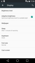
The adaptive display setting
Anyway, below sit the quick settings toggles and we’re happy to report that they’re far more advanced than in KitKat. Clicking on the quick settings toggle does what you’d expect, while the label below it sends you to the full-blown settings page.
There are also some new additions to the quick toggles list. One of them is the Do Not Disturb quick toggle. It’s quite versatile and allows you to mute all notifications for a certain amount of time. You can choose which apps can show notifications, too.
The Do Not Disturb mode also works on calls and messages. Here, you can choose only starred contacts to bother you as well as only contacts, thus blocking unknown numbers. This is a really welcome feature to the stock Android build.
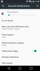
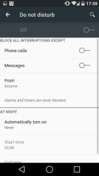
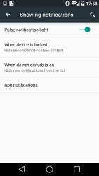
The Do Not Disturb feature is much welcomed
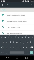
Going over to the full Settings menu, we see Material Design in action. Although the menu isn’t quite the same as we see it in the Google Design guidelines page, it still looks the part. Google has added a search field for a quick settings lookup, too.
Searching the Settings menu
Notably, the battery settings page has been redesigned and once the battery reaches 15%, the new battery life saver mode kicks in. It tunes the CPU and brightness down in an attempt to preserve the little remaining juice for as long as possible.
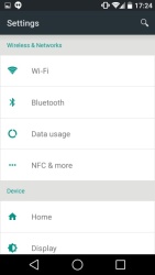
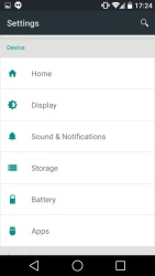
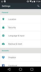
The new Settings menu
The Android L-preview offers a redesigned app switching interface. It is quite reminiscent of the tab interface of Google Chrome, but a bit better looking. Sadly, the looks do take some of the functionality as you can see only a couple of apps at a time.
Google says that in the final build the different Chrome’s opened tabs will be listed individually here, but the L preview didn’t offer this functionality.
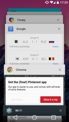
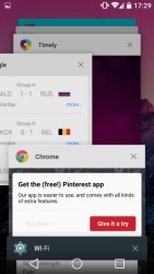
Switching between apps is a new, yet familiar experience
Another redesigned element of the user interface is the keyboard. So much so that you may ask if it even sports any design at all. Gone are the shadows of the individual keys and their texture and now there are just letters on a background, much like iOS 7 and Windows Phone 8.
That’s not to say that it isn’t as functional as before, though. The keyboard also looks good, regardless of the visual overhaul and you can expect it to work just as before.
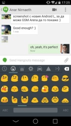
The new Keyboard
We are sad to report that there are not many Google apps that sport the Material Design at this point. In fact, they are just the Dialer and Calculator. Simply put, they look awesome. The fresh colors, clean looks and greatly organized user interface elements make for a simply fantastic experience.
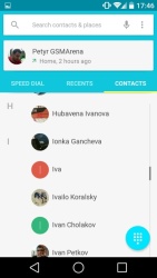
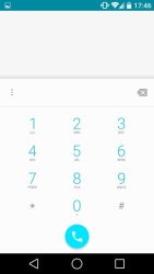
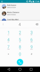
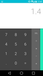
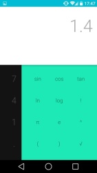
The Dialer and Calculator
We can’t wait for the rest of the apps to catch up in the fall.
In a lengthy keynote at Google I/O Sundar Pichai and his team took their sweet time to reveal Android for pretty much everything: TVs, cars and wearables. They all depend on your Android phone though, and the L release is going to be the major hub they all connect to.
It’s not all roses and sunshine, though. The L preview developer release isn’t a stable affair by any stretch of the imagination. In our test run, the Nexus 5 overheated and the battery was drained by what we assume аре аппс not optimized for the new ART runtime.
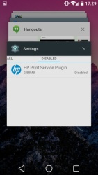
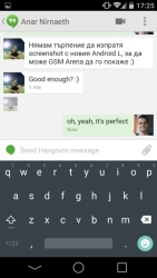
On top of that, we experienced some lag here and there around the user interface. Many apps such as Dropbox, Facebook and Twitter force closed on us randomly, while others failed to install or start altogether. Annoyingly, chat messaging apps like Hangouts and Viber weren’t synchronizing their notifications properly.
Here are a few examples of how the upcoming Music and Gmail apps should look like compared to their current counterparts.
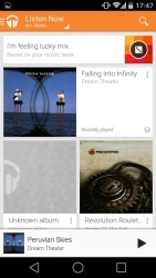
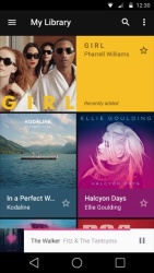
Play Music current • new
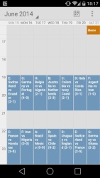
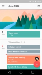
The Calendar current • new
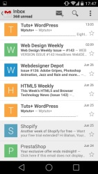
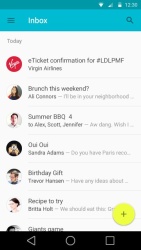
Gmail current • new
There are a lot of expectations on Android’s shoulders so it’s good that the new version of Google brings a lot of new changes to the operating system that are more than a skin deep. Google has about three months until the fall arrives to polish and make the Android L release as stable as possible before prime time. Apple’s iOS 8 will surely be waiting for the best Android has to offer.
Featured
 Hot or Not: Android M, iOS 9 and Watch OS 2.0
 Oppo R1x battery life test
 Xiaomi Mi 4i battery life test
 Your verdict on Android M, iOS 9 and Watch OS 2.0
 HTC One E9+ performance benchmarks
Categories
- Mobile phones
- Mobile software
- Mobile computers
- Rumors
- Fun stuff
- Various
- Android
- Desktop software
- Featured
- Misc gadgets
- Gaming
- Digital cameras
- Tablets
- iOS
- Desktop computers
- Windows Phone
- GSMArena
com - Online Services
- Mobile Services
- Smart Watches
- Battery tests
- BlackBerry
- Social Networks
- Web Browsers
- Portable Players
- Network Operators
- CDMA
- Windows
- Headphones
- Hands-on
Comments
Rules for posting