Sony Ericsson XPERIA X8 pays us a visit, we shoot it on video
Sony Ericsson XPERIA X8 has only recently been announced. It sits somewhere between the X10 mini and the original X10 both size and feature-wise. It’s cute, that’s for sure and it seems like a perfect mix of the two X10′s. It’s still compact and easy to handle, but visually it looks more able-bodied than the diminutive X10 mini.
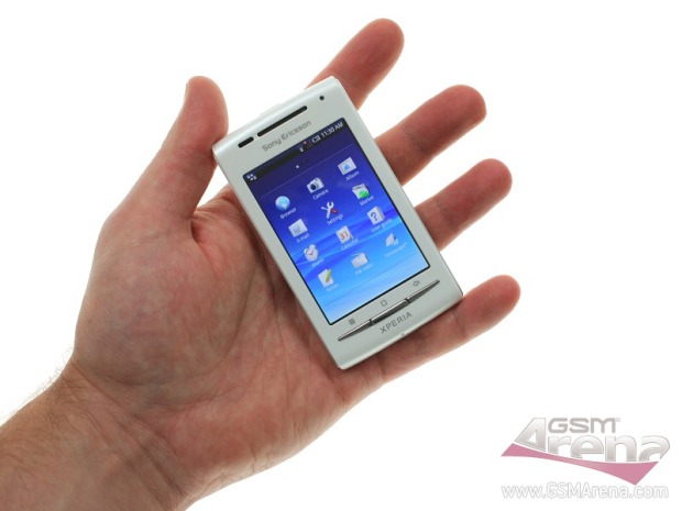
For the XPERIA X8 Sony Ericsson has used the same single-widget-per-single-page homescreen layout that we saw on the X10 mini. They’ve gone for that since X8 has a relatively smallish screen. I think 3-inches is as low as Android smartphones with HVGA resoution have gone down.
So yes, it’s a pixel-dense screen (3-inches, 320 x 480 pixels) and any other layout would have made some items on-screen a bit too small. I can see the logic, but I’d still prefer the regular layout, which is more feature-rich. But that’s just me, I guess.
We’ve prepared a not-so-short video demo to take you throughout the interface. As you will see, X8 performs admirably in most situations. It’s a great compact smartphone, which, as we hear, would be pretty temptingly priced (rumored at 200 euro). So enjoy the show, we’ll get back to you with a more detailed preview in our regular fashion.
P.S. This baby is still a pre-release version, so software changes are likely, though I’d say, there won’t be anything major.
Featured
Categories
- Mobile phones
- Mobile software
- Mobile computers
- Rumors
- Fun stuff
- Various
- Android
- Desktop software
- Featured
- Misc gadgets
- Gaming
- Digital cameras
- Tablets
- iOS
- Desktop computers
- Windows Phone
- GSMArena
com - Online Services
- Mobile Services
- Smart Watches
- Battery tests
- BlackBerry
- Social Networks
- Web Browsers
- Portable Players
- Network Operators
- CDMA
- Windows
- Headphones
- Hands-on
 Lenovo A7000 Preview
 Your verdict on Android M, iOS 9 and Watch OS 2.0
 Oppo R7 battery life test
 Xiaomi Mi 4i battery life test
 HTC One E9+ performance benchmarks
Comments
Rules for posting