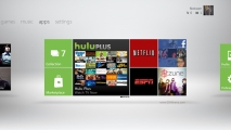
Xbox 360 dashboard redesigned, Metro style
These days it seems every new Microsoft product UI speaks the same language: Metro. First it was the Zune HD, then Windows Phone 7, then Windows 8 (or whatever it’s going to be called) and now finally, the Xbox 360.
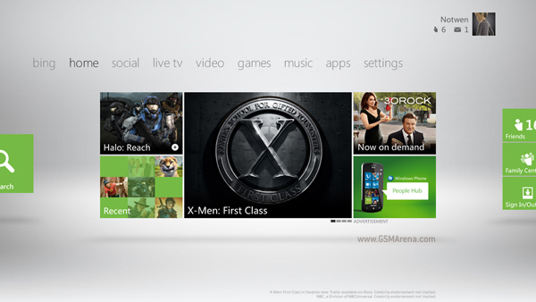
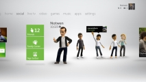
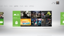
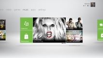
Yes, the Dashboard has gone through another UI redesign and I must say it never looked better. When I first saw Metro UI I didn’t think it would work so well on so many platforms but now I must applaud Microsoft’s design team. The Metro style UI on the Xbox 360 doesn’t seem like it was shoehorned just for the sake of uniformity; it genuinely looks good on it and from what I can tell will work well too. Also, what I don’t see in these screenshots is that massive font on top of Windows Phone 7 devices that used to run off the screen, which is a good thing as it wasn’t the brightest of ideas.
This new Dashboard interface will be released to users this fall and I must say I’m really looking forward to it.
Featured
Categories
- Mobile phones
- Mobile software
- Mobile computers
- Rumors
- Fun stuff
- Various
- Android
- Desktop software
- Featured
- Misc gadgets
- Gaming
- Digital cameras
- Tablets
- iOS
- Desktop computers
- Windows Phone
- GSMArena
com - Online Services
- Mobile Services
- Smart Watches
- Battery tests
- BlackBerry
- Social Networks
- Web Browsers
- Portable Players
- Network Operators
- CDMA
- Windows
- Headphones
- Hands-on
 HTC One E9+ performance benchmarks
 Benchmarking Asus ZenFone 2 ZE551ML with Intel Atom Z3580 SoC and 4GB of RAM
 Oppo R1x battery life test
 Samsung Galaxy S6 updated to Android 5.1.1: exploring the differences on video
 Xiaomi Mi 4i battery life test
Comments
Rules for posting