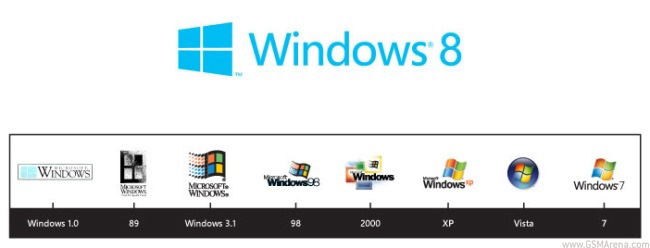
Windows logo gets redesigned for Windows 8
The Windows logo has gone through several changes over the years. What started as a simple, monochrome 2D logo with Windows 1.0 slowly became more complex as more colors were added along with a bit of depth, until it started resembling a flag by the time XP came out. That ‘flag’ then got ensconced inside an orb with Vista and has been the same ever since.

With the Windows 8 logo, Microsoft has attempted to move away from this flag shaped logo towards something that goes well along with the ‘Windows’ name, as well as fit with the new Metro style of the UI. For this they hired the designers at Pentagram and thus the new Windows 8 logo was born.
As you can see, the new logo goes back to the simplicity of the original Windows 1.0 logo but at the same time has the modern look of the Metro UI. In fact, it looks exactly what the tiles on the new Windows Phone 7/Windows 8 look like if they were tilted a bit. The logo is also monochrome, with the default color being blue, however, it will change color depending on the theme set by the user.
As with any kind of design, it is impossible to get a similar reaction from everyone in the crowd and the new logo has understandably been equally lauded and criticized. The biggest criticism is perhaps about the disproportionate size of the logo. The logo looks much larger than the font size next to it. Had it been placed on the right side of the text, it may not have looked that big because the smaller (or further) side of the logo would have been next to the text. Another complaint is about the lack of perspective to the lines in the middle of the logo. You see, the lines on the top and bottom are angled to give a perception of depth but the lines in the middle are completely flat. This results in the shapes in the logo being more of a parallelogram than the squares actually found on the OS.
Personally, I liked the older logo more than the new one, even though I know that the older logo did not go well with the new Metro design and that the four colors are no longer relevant, since the OS has moved towards a monochromatic theme. This doesn’t have anything to do with the technical issues in the new logo. I just think, as a standalone design, the older logo looked better.
So what is your opinion about the new logo? Do let us know in the comments below.

Featured
Categories
- Mobile phones
- Mobile software
- Mobile computers
- Rumors
- Fun stuff
- Various
- Android
- Desktop software
- Featured
- Misc gadgets
- Gaming
- Digital cameras
- Tablets
- iOS
- Desktop computers
- Windows Phone
- GSMArena
com - Online Services
- Mobile Services
- Smart Watches
- Battery tests
- BlackBerry
- Social Networks
- Web Browsers
- Portable Players
- Network Operators
- CDMA
- Windows
- Headphones
- Hands-on
 Xiaomi Mi 4i battery life test
 Benchmarking Asus ZenFone 2 ZE551ML with Intel Atom Z3580 SoC and 4GB of RAM
 Lenovo A7000 Preview
 Samsung Galaxy S6 updated to Android 5.1.1: exploring the differences on video
 HTC One E9+ performance benchmarks
Comments
Rules for posting