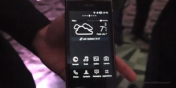
We meet with the LG Prada Phone 3.0, it shows us its user interface [VIDEO]
The Prada Phone by LG 3.0 has just been announced in London, and if you think it looks great on the outside with its slim body, metal accents and the Saffiano leather-looking plastic cover at the back, just wait to see how Prada and LG have pimped the look of the Android OS as well.

Prada are very proud with what they have done design-wise to the look and feel of the Android 2.3 running on the Prada 3.0 and it shows. With its redesigned black and white user interface and special custom widgets this smartphone is one of the most customized fashion-oriented smartphones out there.
But enough talking, time to check out how the user interface on the Prada 3.0 feels like in our hands-on video.
As well as the monochrome icon changing feature, there are matching monochrome widgets unique to the Prada 3.0 and a set of three Prada inspired wallpapers, one of which mirrors that Saffiano leather pattern on the back of the device.
We were also shown the tiered app management system, where you can rename and categorize applications to your hearts desire. This is by far the most capable fashion-orientated phone we’ve seen and once we get some one on one time with it, no doubt we’ll find even more to like. Check out the launch coverage here.
Featured
Categories
- Mobile phones
- Mobile software
- Mobile computers
- Rumors
- Fun stuff
- Various
- Android
- Desktop software
- Featured
- Misc gadgets
- Gaming
- Digital cameras
- Tablets
- iOS
- Desktop computers
- Windows Phone
- GSMArena
com - Online Services
- Mobile Services
- Smart Watches
- Battery tests
- BlackBerry
- Social Networks
- Web Browsers
- Portable Players
- Network Operators
- CDMA
- Windows
- Headphones
- Hands-on
 Oppo R1x battery life test
 Benchmarking Asus ZenFone 2 ZE551ML with Intel Atom Z3580 SoC and 4GB of RAM
 Xiaomi Mi 4i battery life test
 HTC One E9+ performance benchmarks
 HTC One M9+ preview
Comments
Rules for posting