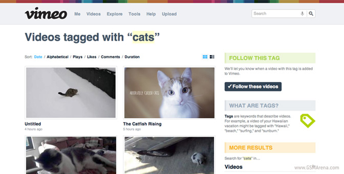
Vimeo rolls out its new design, brings plethora of new features
Vimeo, the established video hosting website for video and design creatives all over the world, is slowly pushing its new design to users around the globe.

As it turns out, this is Vimeo’s first redesign since 2007. According to the site staff, the update is huge and will bring the service up to speeds with its main competitors.
For example videos now take more space on the page, making you focus on the footage itself. After you’ve watched it the Vimeo team will try and make you watch some more with the reorganized “More videos” panel above the video.
Some other tweaks include following people and feed of videos from them, just like on YouTube. One of the most interesting parts of the redesign is the new video upload look. Check it out in Vimeo’s promo video below.
You can learn more about the new Vimeo features from the authors themselves if you follow the source link below.
Featured
Categories
- Mobile phones
- Mobile software
- Mobile computers
- Rumors
- Fun stuff
- Various
- Android
- Desktop software
- Featured
- Misc gadgets
- Gaming
- Digital cameras
- Tablets
- iOS
- Desktop computers
- Windows Phone
- GSMArena
com - Online Services
- Mobile Services
- Smart Watches
- Battery tests
- BlackBerry
- Social Networks
- Web Browsers
- Portable Players
- Network Operators
- CDMA
- Windows
- Headphones
- Hands-on
 Your verdict on Android M, iOS 9 and Watch OS 2.0
 Hot or Not: Android M, iOS 9 and Watch OS 2.0
 Oppo R7 battery life test
 Xiaomi Mi 4i battery life test
 HTC One M9+ preview
Comments
Rules for posting