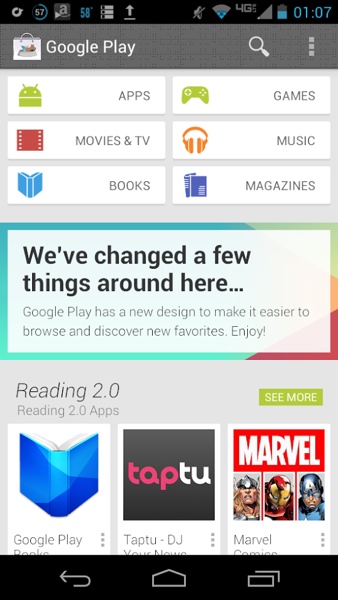
Upcoming Play Store 4.0 screenshot leaked
We got a peek at the upcoming Play Store 4.0 update a while back when the APK for the application got leaked out. Back then, however, while category and content pages were viewable, the home page for the app was unavailable.

Now thanks to this little leak by a YouTube employee, we can finally get a good look at this upcoming update for our Android devices. As you can see, the new app features a more minimalistic and brighter theme, with all the categories arranged up top and suggested content placed below. You will also notice a new, strange pattern for the action bar on top, which will hopefully not make it to the final version, whenever it rolls out. You should ignore the Play Store icon up there for now, which seems specific to this particular build of the app.
The YouTube employee who uploaded the screenshot has since then taken it down (and probably got in trouble for that) but at least we got a look at this new update. If you want to check out the previous screenshot and a hands out video, click here.
Featured
Categories
- Mobile phones
- Mobile software
- Mobile computers
- Rumors
- Fun stuff
- Various
- Android
- Desktop software
- Featured
- Misc gadgets
- Gaming
- Digital cameras
- Tablets
- iOS
- Desktop computers
- Windows Phone
- GSMArena
com - Online Services
- Mobile Services
- Smart Watches
- Battery tests
- BlackBerry
- Social Networks
- Web Browsers
- Portable Players
- Network Operators
- CDMA
- Windows
- Headphones
- Hands-on
 Oppo R1x battery life test
 Hot or Not: Android M, iOS 9 and Watch OS 2.0
 HTC One M9+ preview
 Xiaomi Mi 4i battery life test
 HTC One E9+ performance benchmarks
Comments
Rules for posting