Twitter releases new iPad app, updates iPhone and Android apps
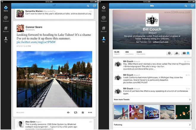
Twitter has released a brand new application for the iPad, which does away completely with the sliding pane design of the previous application, designed by Loren Brichter, creator of the original Tweetie app (now Twitter for iPhone).

The new application now places a single list of tweets on the screen, regardless of whether you hold the iPad in landscape or portrait. It does come across as a terrible waste of screen space, especially in landscape mode and the developers could definitely have put more effort in utilizing all that display area.
The developers have also dropped the ball when it comes to customizing the side bar, with just four icons placed there and important things such as direct messages and lists hidden inside the Me tab. This is just poor UI design and shows that Brichter took all the design talent with him when he left Twitter last year.
Other changes include the presence of an image gallery for your uploaded images in the Me tab and fullscreen mode for viewing images.
In other news, the iPhone and Android version of the application have also been updated. Both get the new image gallery from the iPad version and a new view for your profile in the Me tab but otherwise remain mostly the same.
The iPhone version of the application is still decent but the Android version remains atrocious. It shows a complete disregard for the new Holo theme introduced almost a year ago with Ice Cream Sandwich, shows the same old Gingerbread UI elements such as radio buttons, etc., in the menus even on newer versions of Android and still stutters while scrolling regardless of how powerful your phone’s hardware is. And let’s not forget, there is still no version optimized for Android tablets.
It’s clear then that Twitter does not know how to make a mobile good app for their own service. What’s worse is that they seem intent on clamping down third party developers who are actually doing a good job and slowly forcing people to use their own apps and website.
Featured
Categories
- Mobile phones
- Mobile software
- Mobile computers
- Rumors
- Fun stuff
- Various
- Android
- Desktop software
- Featured
- Misc gadgets
- Gaming
- Digital cameras
- Tablets
- iOS
- Desktop computers
- Windows Phone
- GSMArena
com - Online Services
- Mobile Services
- Smart Watches
- Battery tests
- BlackBerry
- Social Networks
- Web Browsers
- Portable Players
- Network Operators
- CDMA
- Windows
- Headphones
- Hands-on
 HTC One E9+ performance benchmarks
 Benchmarking Asus ZenFone 2 ZE551ML with Intel Atom Z3580 SoC and 4GB of RAM
 Xiaomi Mi 4i battery life test
 Lenovo A7000 Preview
 Oppo R7 battery life test
Comments
Rules for posting