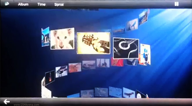
Tizen OS gallery demo surfaces, looks impressive
Tizen – what became of MeeGo after Samsung took Nokia’s place in the project and also Bada’s replacement – kept a very low profile at the MWC, but it was there. A short video demo of the gallery shows that the new OS delivers a lot of eye candy even in this early stage of its development.

Earlier this year we saw some Tizen screenshots, but the traditional grid of thumbnails has given way to a less useful, but definitely prettier 3D arrangement. Check it out:
As you can see from the video, you can still go back to the thumbnail grid after you’re done playing around with the 3D views of the gallery.
It’s nice to see that Tizen isn’t going the solid colors on black background way (a la Metro and Android ICS). Do you like the look of the new OS or are you tired of all the gaudy 3D stuff?
Featured
Categories
- Mobile phones
- Mobile software
- Mobile computers
- Rumors
- Fun stuff
- Various
- Android
- Desktop software
- Featured
- Misc gadgets
- Gaming
- Digital cameras
- Tablets
- iOS
- Desktop computers
- Windows Phone
- GSMArena
com - Online Services
- Mobile Services
- Smart Watches
- Battery tests
- BlackBerry
- Social Networks
- Web Browsers
- Portable Players
- Network Operators
- CDMA
- Windows
- Headphones
- Hands-on
 Hot or Not: Android M, iOS 9 and Watch OS 2.0
 Benchmarking Asus ZenFone 2 ZE551ML with Intel Atom Z3580 SoC and 4GB of RAM
 Samsung Galaxy S6 updated to Android 5.1.1: exploring the differences on video
 HTC One E9+ performance benchmarks
 Lenovo A7000 Preview
Comments
Rules for posting