The monstrous Sony Xperia Z Ultra pays HQ a visit, we swiftly arrange a video unboxing
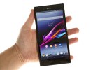
We met the Sony Xperia Z Ultra at its official announcement and now it’s finally graced our office! Sony’s beast of a phablet has come to our headquarters for a thorough examination, and we’ve already started giving it the full review treatment. Until that is complete though, you might want to check out a short video of its unboxing, followed by a UI walkthrough.
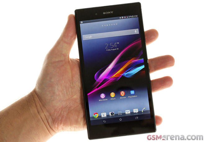
The list of tricks the Sony Xperia Z Ultra knows is almost too long to fit on even its sizable screen. Seriously, this beast is packed to the rafters with cool features. It slots between the Xperia Z and Xperia Tablet Z, using the same sleek OmbiBalance design and philosophy – “glass is good, thin is better”.
Make no mistake about it, the Xperia Z Ultra is a large device, it even dwarfs the Samsung Galaxy Mega 6.3. It packs a 6.4″ 1080p Triluminos display, which results in a pixel density of 334ppi. It’s not only sharp, but it also boasts great colors and contrast thanks to its OptiContrast panel and X-Reality engine – Sony has really thrown the kitchen sink at this one.
And the results is really quite impressive – this is easily the most impressive device to come out of the Sony R&D labs lately.
The 6.5mm of thickness is quite stunning. The angular sides don’t make the Xperia Z Ultra the most comfortable device to hold in one hand, but for two handed operation the slim chassis feels really nice. It’s not too heavy either – 212g is certainly a burden you will feel in your pocket, but it’s barely any heavier than the Samsung Galaxy Mega 6.3 and that is all plastic, no metal, no glass.
Inside the Xpera Z Ultra lives the mighty Snapdragon 800 chipset packing four 2.2GHz Krait 400 cores, 2GB of RAM and an Adreno 330 GPU. The upshot is virtually no lag, hiccups or slowdowns when you open or close apps, roam around the UI or view heavy web pages.
At the official announcement of the Xperia Z Ultra, the company showcased a lot of cool accessories tailor-made for the phablet. Among them are the Smart Bluetooth Handset, Wirelss speakers and the Magnetic Charging Dock. The last of those came in our retail box and got to see it use the two pogo pins found on the left hand side of the Xperia Z Ultra to snap to it and charge the phablet.
It works only with a wall charger (the one Sony included in the box outputs 1.5A), so no USB charging works here.
Anyhow, here’s the Sony Xperia Z Ultra unboxing video complete with a short tour of the updated Xperia UI that has been tailored for the large display of the phone.
Stay tuned for the full Sony Xperia Z Ultra review!
Featured
Categories
- Mobile phones
- Mobile software
- Mobile computers
- Rumors
- Fun stuff
- Various
- Android
- Desktop software
- Featured
- Misc gadgets
- Gaming
- Digital cameras
- Tablets
- iOS
- Desktop computers
- Windows Phone
- GSMArena
com - Online Services
- Mobile Services
- Smart Watches
- Battery tests
- BlackBerry
- Social Networks
- Web Browsers
- Portable Players
- Network Operators
- CDMA
- Windows
- Headphones
- Hands-on
 Your verdict on Android M, iOS 9 and Watch OS 2.0
 Oppo R1x battery life test
 Samsung Galaxy S6 updated to Android 5.1.1: exploring the differences on video
 Oppo R7 battery life test
 HTC One E9+ performance benchmarks
Comments
Rules for posting