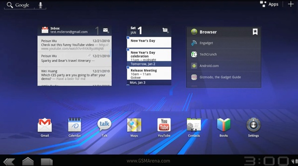
Tablet-oriented Android 3.0 Honeycomb presented on video, looks awesome
We already knew Android 3.0 Honeycomb is designed specifically with tablets in mind, but until today I’ve never seen a detailed demo from up-close.

At this year’s CES, Google has published a short video demo of the upcoming Honeycomb tablet version and it’s awesome. Here is the video:
Android 3.0 Honeycomb has a completely new user interface based around 3D desktops and various interactive widgets. The multi-tasking and its UI, the notifications and menus, the Gmail and YouTube looks have also been redesigned for bigger screens.
Honeycomb also packs the new Google Maps 5 version – the first with 3D vector graphics – and brings along a new web browser capable of tabs, Flash, auto-fill, private browsing and bookmark sync with Chrome. In fact the Android 3.0 web browser looks, feels and behaves just like a desktop one.
There is no info how this version will fit in mobile phones, but I guess we should get more info soon.
Featured
Categories
- Mobile phones
- Mobile software
- Mobile computers
- Rumors
- Fun stuff
- Various
- Android
- Desktop software
- Featured
- Misc gadgets
- Gaming
- Digital cameras
- Tablets
- iOS
- Desktop computers
- Windows Phone
- GSMArena
com - Online Services
- Mobile Services
- Smart Watches
- Battery tests
- BlackBerry
- Social Networks
- Web Browsers
- Portable Players
- Network Operators
- CDMA
- Windows
- Headphones
- Hands-on
 Xiaomi Mi 4i battery life test
 Samsung Galaxy S6 updated to Android 5.1.1: exploring the differences on video
 HTC One E9+ performance benchmarks
 Lenovo A7000 Preview
 Oppo R1x battery life test
Comments
Rules for posting