Sony Tablet P and Tablet S hands-on
Yes, yes, we know Sony’s Tablet P and Tablet S aren’t exactly hot or new in the tech world, but even a few months after their market release they are still quite interesting.
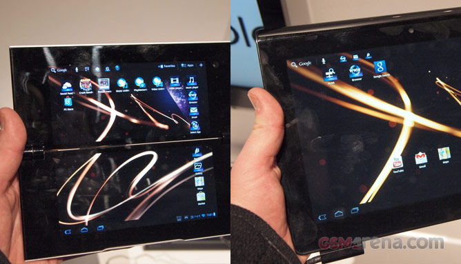
Sony put a lot of effort into differentiating its two tablets from the pack of Android slates out there and it’s done a really good job. The Tablet P for example, with it’s dual touchscreens, is as bold a slate as it gets and the magazine-like Tablet S is not the most common of sights either. Let’s dive in.
Sony Tablet P
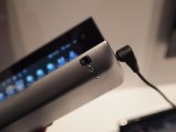
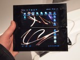
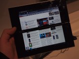
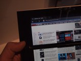
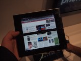
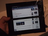
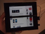
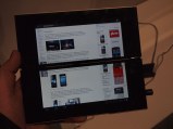
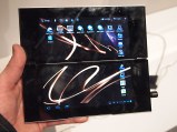
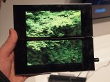
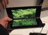
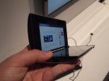
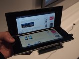
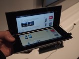
The Tablet P is an rather extraordinary Android tablet. It’s got a folding design with two separate 5.5-inch touchscreens and runs Android 3.2 Honeycomb, with Ice Cream Sandwich expected to come this year. Sony has done a nice job of limiting the space between the screens as much as possible and so increasing usability.
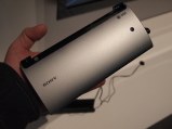
This little guy is a proudly carrying the PlayStation logo, symbolizing its Playstation certification. This means that you can play various PSOne games. The controls stay on the bottom screen, while the top one displays all the action.
Opinions seem to be divided on the Sony Tablet P’s design. You either love it or hate it. We are willing to give it the benefit of doubt even if we are not so sure it’ll fit well in our pockets. Oh, and if you are getting one, you better bring a cloth with you at all times, as the Tablet P attract fingerprints like crazy.
Sony Tablet S
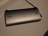
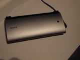
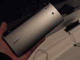
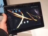
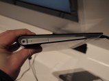
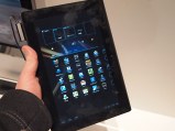
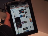
The Tablet S, unlike it’s more ravish-looking cousin, take a more traditional approach to tablets in the sense that it has just one 9.4-inch touchscreen. But then the traditional ends, as Sony designed the Tablet S to resemble a folded magazine.
This not only gives the Tablet S a funkier look compared to its slate rivals, but also makes it easier to hold and to write on, when put on a flat surface. It’s powered by the same dual-core Tegra 2 chip as the Tablet P and has 1GB of RAM.
Featured
Categories
- Mobile phones
- Mobile software
- Mobile computers
- Rumors
- Fun stuff
- Various
- Android
- Desktop software
- Featured
- Misc gadgets
- Gaming
- Digital cameras
- Tablets
- iOS
- Desktop computers
- Windows Phone
- GSMArena
com - Online Services
- Mobile Services
- Smart Watches
- Battery tests
- BlackBerry
- Social Networks
- Web Browsers
- Portable Players
- Network Operators
- CDMA
- Windows
- Headphones
- Hands-on



 Lenovo A7000 Preview
 Your verdict on Android M, iOS 9 and Watch OS 2.0
 Hot or Not: Android M, iOS 9 and Watch OS 2.0
 Xiaomi Mi 4i battery life test
 Samsung Galaxy S6 updated to Android 5.1.1: exploring the differences on video
Comments
Rules for posting