Redesigned Google Maps appears on screenshots, goes for Google Now-like design
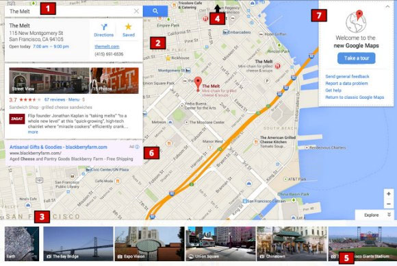
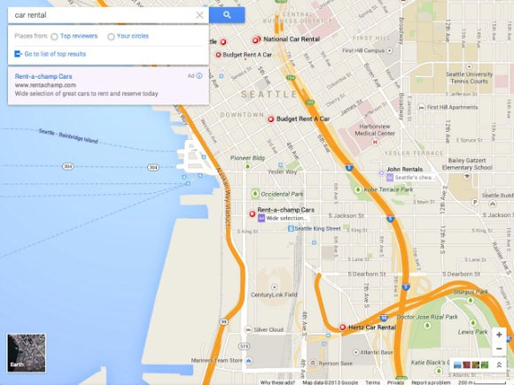
Thanks to a couple of screenshots that leak-focused Google Operating System blog got hold of, we can now take a glimpse of what the redesigned Maps service will looks like.

The Maps design refresh is in line with Google’s new design language that we first saw in Google Now. Evidently, the left sidebar is now gone and is replaced with cards that show different pieces of information and navigation options.
Another thing that we can learn from the screenshots is that Google+ sees deeper integration within the mapping service. In the new version of Maps you’ll be able to narrow filter search results down to places that your friends have gone to or liked.

Naturally, the new design brings a new icon set as well as colors to the maps themselves.The Android Maps app is also expected to get a redesign and start to look more like its iOS sibling, but we are yet to see screenshots of that
Google I/O is not too far away, merely a week away in fact. At the Google developer conference, the company is having a panel dedicated entirely to Maps called “Into the future”. You can rest assured that the search giant is going to showcase the work it has done to Maps.
Featured
Categories
- Mobile phones
- Mobile software
- Mobile computers
- Rumors
- Fun stuff
- Various
- Android
- Desktop software
- Featured
- Misc gadgets
- Gaming
- Digital cameras
- Tablets
- iOS
- Desktop computers
- Windows Phone
- GSMArena
com - Online Services
- Mobile Services
- Smart Watches
- Battery tests
- BlackBerry
- Social Networks
- Web Browsers
- Portable Players
- Network Operators
- CDMA
- Windows
- Headphones
- Hands-on
 Oppo R1x battery life test
 Benchmarking Asus ZenFone 2 ZE551ML with Intel Atom Z3580 SoC and 4GB of RAM
 Oppo R7 battery life test
 Samsung Galaxy S6 updated to Android 5.1.1: exploring the differences on video
 Your verdict on Android M, iOS 9 and Watch OS 2.0
Comments
Rules for posting