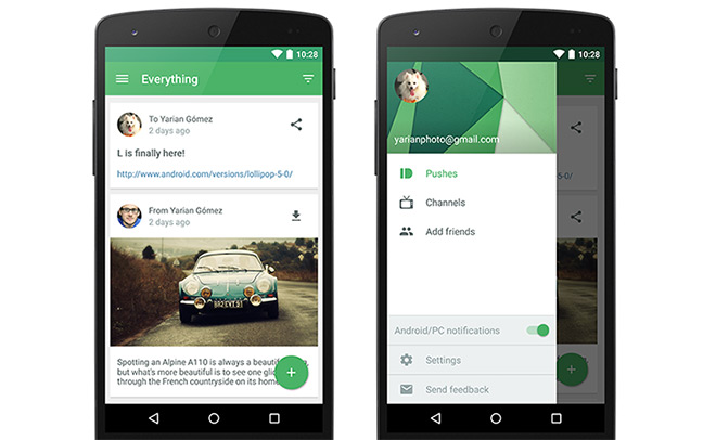
Pushbullet for Android now sports Material Design
To better fit into the Android 5.0 Lollipop frame, Pushbullet has been updated to the Material Design UI standard. As part of the new look, Pushbullet is now easier to navigate and quicker to access channel and settings.

The main screen now shows you at-a-glance view of your pushes or those of your contacts. Your favorite channels are accessible with a swipe to the right. Visually, there’s now dynamic color theming, cards interface and enhanced animations.
Follow the source link below to get the full rundown of everything that’s new in the latest version of Pushbullet. And don’t forget to hit the Update button if you have disabled automatic updates in the Play Store.
Featured
Categories
- Mobile phones
- Mobile software
- Mobile computers
- Rumors
- Fun stuff
- Various
- Android
- Desktop software
- Featured
- Misc gadgets
- Gaming
- Digital cameras
- Tablets
- iOS
- Desktop computers
- Windows Phone
- GSMArena
com - Online Services
- Mobile Services
- Smart Watches
- Battery tests
- BlackBerry
- Social Networks
- Web Browsers
- Portable Players
- Network Operators
- CDMA
- Windows
- Headphones
- Hands-on
 Hot or Not: Android M, iOS 9 and Watch OS 2.0
 HTC One E9+ performance benchmarks
 Benchmarking Asus ZenFone 2 ZE551ML with Intel Atom Z3580 SoC and 4GB of RAM
 HTC One M9+ preview
 Your verdict on Android M, iOS 9 and Watch OS 2.0
Comments
Rules for posting