Nokia updates Symbian apps design guidelines, tells developers to keep it nice and minimal
Nokia has updated the Symbian developers guidelines, which should be used by 3rd party developers when creating new Symbian apps. According to the company the new guidelines “should be seen as a style evolution, not a revolution”, but changes are quite significant nonetheless.
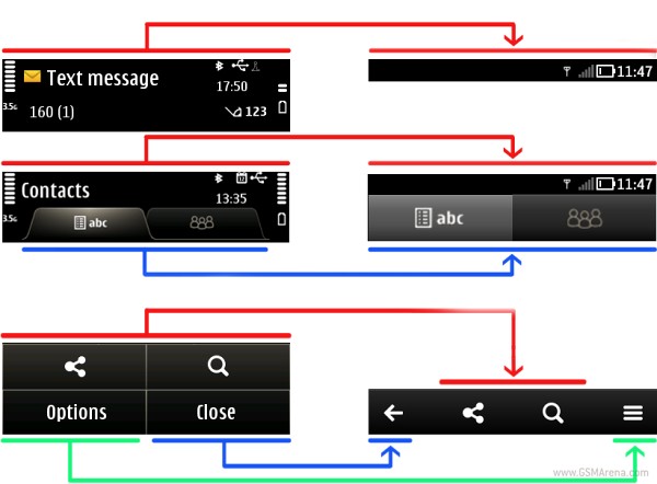
The first thing you can expect from future Symbian apps is to use a smaller status bar. So far quite a lot of space got wasted, but Nokia urges the developers to end this. The tab bars should also be updated so they are now easier to press (they should fill the entire row).
Finally the toolbar at the bottom should be kept to a single line, which should free some more space at the bottom of the screen for the actual content.
To make it easier for developers to follow those guidelines Nokia has added ready-made UI building blocks to Qt Quick framework. Those should make it sticking to the new styling a walk in the park as developers won’t need to worry about designing the UI elements themselves.
Nokia has also urged its partners to keep their applications simple and easy to use and distribute its functionality accordingly. That would mean that more important features are in the top bar where they are most visible, while secondary ones should be sent elsewhere.
If those instructions are followed that would certainly be a great step forward for the Symbian apps (well most of them anyway), but did the developers really need Nokia telling them those? After all they sound all too simple for someone in program design not to figure them out by themselves.
Featured
 HTC One E9+ performance benchmarks
 Benchmarking Asus ZenFone 2 ZE551ML with Intel Atom Z3580 SoC and 4GB of RAM
 Lenovo A7000 Preview
 Your verdict on Android M, iOS 9 and Watch OS 2.0
 Oppo R1x battery life test
Categories
- Mobile phones
- Mobile software
- Mobile computers
- Rumors
- Fun stuff
- Various
- Android
- Desktop software
- Featured
- Misc gadgets
- Gaming
- Digital cameras
- Tablets
- iOS
- Desktop computers
- Windows Phone
- GSMArena
com - Online Services
- Mobile Services
- Smart Watches
- Battery tests
- BlackBerry
- Social Networks
- Web Browsers
- Portable Players
- Network Operators
- CDMA
- Windows
- Headphones
- Hands-on
Comments
Rules for posting