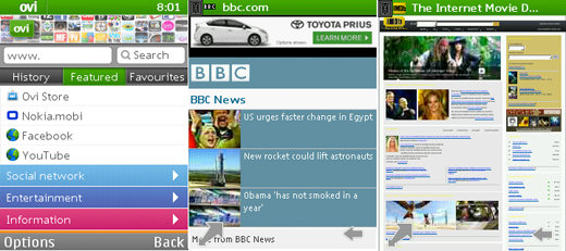
Nokia releases new beta of the Ovi Browser, still looks like knock-off Opera Mini despite UI polish
Nokia has been mentioning their Ovi Browser more often than not – and they’ve released a new beta version to try out. It has received some polish since we saw it last year.

Sounds good, but is it good enough to beat the current king of feature phone browsing, Opera Mini?…
The latest beta of Ovi Browser comes with a new start page – it offers a collection of popular links right off the bat. India, Indonesia, Russia and China have localized start pages, while the rest of the world sees a general start page with popular links (Facebook, Twitter and other globally popular sites).
The menu bar at the bottom of the screen has been replaced with floating buttons, which use the screen real estate more efficiently.
Ovi Browser uses a proxy to reformat and compress the web page (up to 90%) before sending it to the device – basically the same trick that Opera Mini does. Still, Opera Mini 5 offers tabs and Speed Dial seems like the better start page, so Nokia still have a ways to go before they convince me to switch.
The Ovi Browser beta is available in 85 languages. You can get it from the Ovi Store but unfortunately, the Store seems to be having some issues right now since it says it’s not available in my language (I tried changing it to anything from English to Hindi).
Featured
Categories
- Mobile phones
- Mobile software
- Mobile computers
- Rumors
- Fun stuff
- Various
- Android
- Desktop software
- Featured
- Misc gadgets
- Gaming
- Digital cameras
- Tablets
- iOS
- Desktop computers
- Windows Phone
- GSMArena
com - Online Services
- Mobile Services
- Smart Watches
- Battery tests
- BlackBerry
- Social Networks
- Web Browsers
- Portable Players
- Network Operators
- CDMA
- Windows
- Headphones
- Hands-on
 Oppo R7 battery life test
 Xiaomi Mi 4i battery life test
 Samsung Galaxy S6 updated to Android 5.1.1: exploring the differences on video
 Hot or Not: Android M, iOS 9 and Watch OS 2.0
 Oppo R1x battery life test
Comments
Rules for posting