Nokia Hong Kong thinks iOS 7 looks pretty close to its beloved Windows Phone
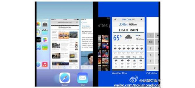
Windows Phone pioneered the flat UI on mobile and the new iOS 7 look shares a lot of similarities – at least whoever maintains the Nokia Hong Kong’s Weibo account thinks so. They created this image and challenged users to pick which side is WP8 and which side is iOS 7.

There’s one more side-by-side comparison after the break.

To be fair, the card-based multitasking was introduced by WebOS and then copied and tweaked by almost every other OS.
You can check out our hands-on video with OS 7 running on the Apple iPhone 5.
Featured
Categories
- Mobile phones
- Mobile software
- Mobile computers
- Rumors
- Fun stuff
- Various
- Android
- Desktop software
- Featured
- Misc gadgets
- Gaming
- Digital cameras
- Tablets
- iOS
- Desktop computers
- Windows Phone
- GSMArena
com - Online Services
- Mobile Services
- Smart Watches
- Battery tests
- BlackBerry
- Social Networks
- Web Browsers
- Portable Players
- Network Operators
- CDMA
- Windows
- Headphones
- Hands-on
 Oppo R1x battery life test
 HTC One M9+ preview
 Xiaomi Mi 4i battery life test
 Your verdict on Android M, iOS 9 and Watch OS 2.0
 Benchmarking Asus ZenFone 2 ZE551ML with Intel Atom Z3580 SoC and 4GB of RAM
Comments
Rules for posting