Newest Windows 8 Start Screen photo confirms previous leaks
There have already been some leaks of the new Windows Start Menu that found their way online.

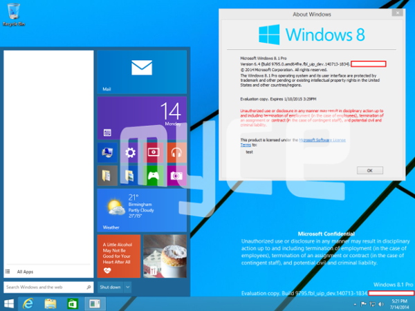
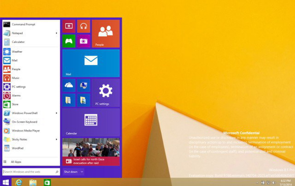
The newest reveal all but confirms the look of Microsoft’s upcoming Start Menu screen, corroborating what previous leaks have shown us.
Looking like a blend of Windows 7 and 8, the boxy design aesthetic of 8 is in full play here, adding Metro style icons to the traditional Start Menu.

A previous start menu screen leak reveals a similar design, but also showcases the ability to change the size of the Metro tiles in the start menu, meaning that the screen will emphasize customization, but without taking long-time Windows users out of their comfort zones.

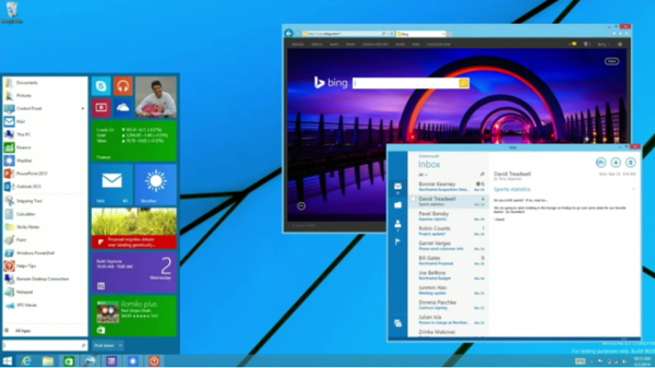
Also, if you take a look at this final leaked image that Microsoft showed off at its Build conference, it’s pretty much safe to assume that the newest Windows Start Menu screen won’t look much different from the images you see here.

What do you think of the newest design? Are you happy Microsoft has brought back the Start Menu? Or do you think that the software giant should have stuck to trying to make its tile-centric UI work?
Featured
Categories
- Mobile phones
- Mobile software
- Mobile computers
- Rumors
- Fun stuff
- Various
- Android
- Desktop software
- Featured
- Misc gadgets
- Gaming
- Digital cameras
- Tablets
- iOS
- Desktop computers
- Windows Phone
- GSMArena
com - Online Services
- Mobile Services
- Smart Watches
- Battery tests
- BlackBerry
- Social Networks
- Web Browsers
- Portable Players
- Network Operators
- CDMA
- Windows
- Headphones
- Hands-on
 HTC One M9+ preview
 Your verdict on Android M, iOS 9 and Watch OS 2.0
 Lenovo A7000 Preview
 Benchmarking Asus ZenFone 2 ZE551ML with Intel Atom Z3580 SoC and 4GB of RAM
 Hot or Not: Android M, iOS 9 and Watch OS 2.0
Comments
Rules for posting