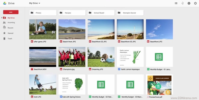
New UI for Google Drive starts rolling out online
Google Drive is getting a new interface, and we’re not talking about apps in this particular case. Rather, the Web-based Drive is the one getting the new coat of paint. The new design has already started rolling out to users across the world.

It brings with it a new default view that uses a thumbnail grid instead of a list, a shiny big red New button that combines uploading stuff to Drive with creating new documents, and desktop-like selection tools.
You can now click and drag things, use drag and drop, and select multiple items just like you would when using your computer’s built-in file manager. You’re even able to right click a selection to take actions.
The New button surfaces options for creating folders or files, as well as getting things from your computer onto Google Drive. Details about files are now a single click away in the home screen, opening up as a pane on the right hand side of the online interface. The first part of the following video explains the new features in detail.
The new design is slowly spreading to Drive users. When your account is ready to get it, you’ll see a prompt to “try the new Drive” appear. You can then enable the new UI from the Settings menu by choosing to “Experience the new Drive”.
Featured
Categories
- Mobile phones
- Mobile software
- Mobile computers
- Rumors
- Fun stuff
- Various
- Android
- Desktop software
- Featured
- Misc gadgets
- Gaming
- Digital cameras
- Tablets
- iOS
- Desktop computers
- Windows Phone
- GSMArena
com - Online Services
- Mobile Services
- Smart Watches
- Battery tests
- BlackBerry
- Social Networks
- Web Browsers
- Portable Players
- Network Operators
- CDMA
- Windows
- Headphones
- Hands-on
 Lenovo A7000 Preview
 Xiaomi Mi 4i battery life test
 Samsung Galaxy S6 updated to Android 5.1.1: exploring the differences on video
 Oppo R7 battery life test
 Hot or Not: Android M, iOS 9 and Watch OS 2.0
Comments
Rules for posting