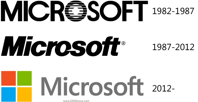
Microsoft changes its logo for only the third time in its history, old one lasted 25 years
Microsoft is pushing hard to unify all its products. Metro – um, sorry, Modern UI/Windows 8 UI – is permeating everything from the smartphone OS, desktop OS, Office, Xbox and now even the company’s logo.

The old logo is probably quite familiar to anyone who has used a computer in the last 25 years. No, that’s not an exaggeration, it’s how long the old logo had been in use.
The new logo is similar to that of Windows 8, except it retains the colors and isn’t tilted. The font used in the logo is Segoe – the same font used in Windows 8, Windows Phone, Outlook.com and other Microsoft-made UIs.
Check out this video to see the various new logos of Microsoft products:
Also, Microsoft.com has been redesigned to use the Metro aesthetic (yes, that’s what I’m calling it) and three of Microsoft’s retail store have been updated too (Boston, Seattle’s University Village and Bellevue, Wash.).
How long do you think this new logo will last – another 25 years or until Windows 9 does away with the whole Metro thing?
Featured
Categories
- Mobile phones
- Mobile software
- Mobile computers
- Rumors
- Fun stuff
- Various
- Android
- Desktop software
- Featured
- Misc gadgets
- Gaming
- Digital cameras
- Tablets
- iOS
- Desktop computers
- Windows Phone
- GSMArena
com - Online Services
- Mobile Services
- Smart Watches
- Battery tests
- BlackBerry
- Social Networks
- Web Browsers
- Portable Players
- Network Operators
- CDMA
- Windows
- Headphones
- Hands-on
 Samsung Galaxy S6 updated to Android 5.1.1: exploring the differences on video
 Benchmarking Asus ZenFone 2 ZE551ML with Intel Atom Z3580 SoC and 4GB of RAM
 Lenovo A7000 Preview
 HTC One M9+ preview
 HTC One E9+ performance benchmarks
Comments
Rules for posting