Microsoft alters Windows 8 desktop look to match Metro UI
A lot of people have complained about the discrepancy between the two modes on Windows 8. As you may know, Windows 8 will ship with the new Metro UI as well as a standard desktop mode for legacy apps. While the Metro side of the OS looks modern and fresh, the desktop version looks almost similar to older versions of Windows and the two couldn’t be more different.
Microsoft has heard your complaints and although they won’t be redesigning the desktop side in Metro they have made some changes to the existing UI to be more in sync with the Metro design language.
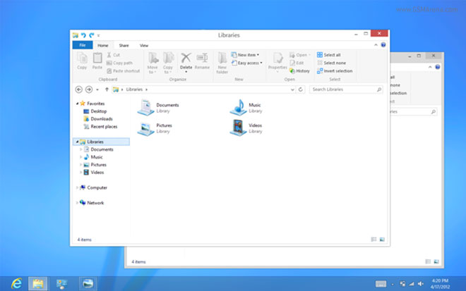
For starters, the Aero look is gone. Aero was the name of the UI design that debuted with Windows Vista and featured a ton of transparency effects and glossy finishes to the window chrome. Although these were meant for the user to focus more on the app content and less on the window chrome, which was supposed to blend with the background, it’s not the kind of design that ages well and most certainly does not gel with the flat look of the Metro UI.
So now the window chrome won’t be transparent anymore. Nor will it be glossy or have glowing buttons or exaggerated shadows surrounding the window. It now has a cleaner, flatter look to it that’s a lot simpler and almost reminds me of the Windows 95 days. The default window chrome will be in white, although there may be an option to customize it. However, without the lack of transparency, a colored window chrome will just be distracting so don’t be surprised if white is the only option. The taskbar, however, remains transparent.
Some of these changes will reflect in the upcoming Release Preview, however, you will only see the full impact of these changes in the final version of Windows 8, expected to go on sale later this year around October.
So how do you like this new change? Let us know in the comments below.
Featured
 Benchmarking Asus ZenFone 2 ZE551ML with Intel Atom Z3580 SoC and 4GB of RAM
 Oppo R1x battery life test
 Hot or Not: Android M, iOS 9 and Watch OS 2.0
 HTC One M9+ preview
 Your verdict on Android M, iOS 9 and Watch OS 2.0
Categories
- Mobile phones
- Mobile software
- Mobile computers
- Rumors
- Fun stuff
- Various
- Android
- Desktop software
- Featured
- Misc gadgets
- Gaming
- Digital cameras
- Tablets
- iOS
- Desktop computers
- Windows Phone
- GSMArena
com - Online Services
- Mobile Services
- Smart Watches
- Battery tests
- BlackBerry
- Social Networks
- Web Browsers
- Portable Players
- Network Operators
- CDMA
- Windows
- Headphones
- Hands-on
Comments
Rules for posting