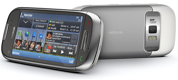
Lead designer of Nokia C7 talks about design and influences
We’re getting ready to review the Nokia C7, so this caught our interest – the lead designer of the C7 talking about the process he went through. It’s interesting to see what goes on on the other side – how those phones that we’re reviewing get to be the way they are?

The design process of the Nokia C7 started with choosing its measurements – the weight and most importantly, the size of the display. Once Tomas Ivaškevičius, the lead designer for the C7, had picked a screen size that fits well in the hand, he designed everything else around it.
It wasn’t easy – he describes it as a complex balancing act between adding and taking things away and filtering through a lot of input from his boss and colleagues. Tomas begins the video by saying that he spent entire days at school drawing cars – I wonder if that’s the inspiration behind the curves of the Nokia C7?
Anyway, with this video in mind, we’re going back to the C7 review. Stay tuned.
Featured
Categories
- Mobile phones
- Mobile software
- Mobile computers
- Rumors
- Fun stuff
- Various
- Android
- Desktop software
- Featured
- Misc gadgets
- Gaming
- Digital cameras
- Tablets
- iOS
- Desktop computers
- Windows Phone
- GSMArena
com - Online Services
- Mobile Services
- Smart Watches
- Battery tests
- BlackBerry
- Social Networks
- Web Browsers
- Portable Players
- Network Operators
- CDMA
- Windows
- Headphones
- Hands-on
 Your verdict on Android M, iOS 9 and Watch OS 2.0
 HTC One E9+ performance benchmarks
 Oppo R1x battery life test
 Benchmarking Asus ZenFone 2 ZE551ML with Intel Atom Z3580 SoC and 4GB of RAM
 Xiaomi Mi 4i battery life test
Comments
Rules for posting