Google redesigns Gmail and Calendar, makes it cleaner and more minimalistic
Hot on the heels of the Google+ launch Google has updated the look of two of its most popular web apps, Gmail and Calendar. The new look jibes well with the look of the new Google homepage and Google+, providing a more unified interface.
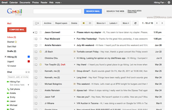
In Gmail you will notice just how clean the new interface is. Every thing looks simpler, focused, more direct. There is also plenty of negative space being used to provide some relief to your eyes and the whole thing seem less cluttered. In my opinion, Gmail never looked better.
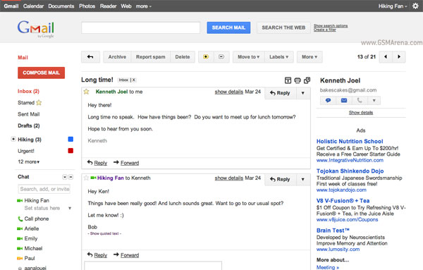
The new look isn’t permanent for now though. You will have to manually select it from the Themes menu in mail settings, however, moving on it will become the default look, with the option to change it of course. Google also admits that it may be a bit rough around the edges and some Labs features may look strange in the new theme. They are also planning on launching a darker version of this theme for those working in dark environments.
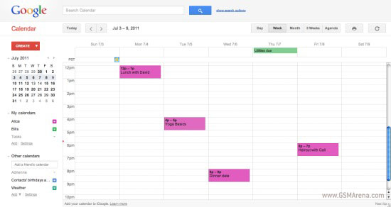
Calendar too gets the new look but unlike Gmail it is not optional. But that is fine with me as like Gmail, Calendar never looked better.
Featured
 Your verdict on Android M, iOS 9 and Watch OS 2.0
 Hot or Not: Android M, iOS 9 and Watch OS 2.0
 Xiaomi Mi 4i battery life test
 HTC One E9+ performance benchmarks
 Benchmarking Asus ZenFone 2 ZE551ML with Intel Atom Z3580 SoC and 4GB of RAM
Categories
- Mobile phones
- Mobile software
- Mobile computers
- Rumors
- Fun stuff
- Various
- Android
- Desktop software
- Featured
- Misc gadgets
- Gaming
- Digital cameras
- Tablets
- iOS
- Desktop computers
- Windows Phone
- GSMArena
com - Online Services
- Mobile Services
- Smart Watches
- Battery tests
- BlackBerry
- Social Networks
- Web Browsers
- Portable Players
- Network Operators
- CDMA
- Windows
- Headphones
- Hands-on
Comments
Rules for posting