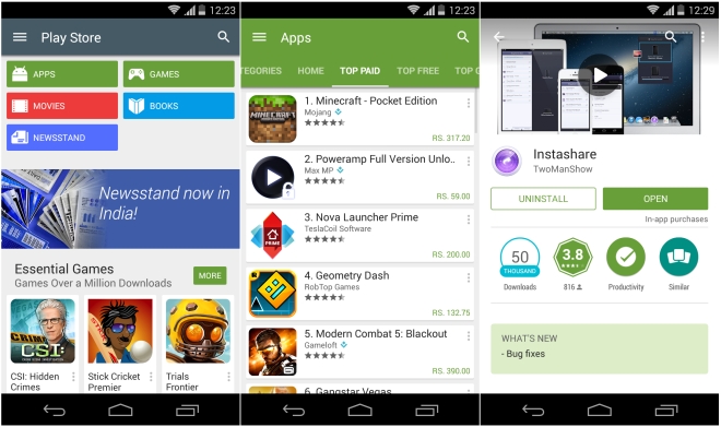
Google Play Store updated to v5.0, gets more Material Design elements
Google has started rolling out v5.0.31 of the Play Store for Android. The major difference here is in the UI, and it’s approximately 600% more Material Design now.

First up, the action bar on top is now teal (or something close to that) with a new side menu and a cool animation for the hamburger button. The side menu shows the same items now, but the font is smaller.
In app lists you’ll find that the color of the action bar now applies to the categories below as well. As for the app pages, the ‘What’s New’ section is now at the top with highlight and stays at the top instead of going all the way down when you tap the ‘Read More’ button for description.
Other than that I’d say it more or less looks similar with minor design changes here and there. The update has started rolling out but as usual could take days or weeks before it reaches you, so might as well just head over to the source link below and download the APK now.
Featured
Categories
- Mobile phones
- Mobile software
- Mobile computers
- Rumors
- Fun stuff
- Various
- Android
- Desktop software
- Featured
- Misc gadgets
- Gaming
- Digital cameras
- Tablets
- iOS
- Desktop computers
- Windows Phone
- GSMArena
com - Online Services
- Mobile Services
- Smart Watches
- Battery tests
- BlackBerry
- Social Networks
- Web Browsers
- Portable Players
- Network Operators
- CDMA
- Windows
- Headphones
- Hands-on
 Oppo R7 battery life test
 Your verdict on Android M, iOS 9 and Watch OS 2.0
 Xiaomi Mi 4i battery life test
 Benchmarking Asus ZenFone 2 ZE551ML with Intel Atom Z3580 SoC and 4GB of RAM
 Samsung Galaxy S6 updated to Android 5.1.1: exploring the differences on video
Comments
Rules for posting