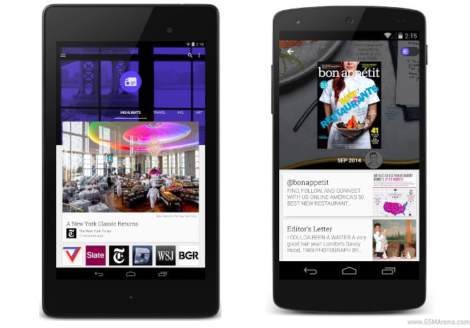
Google Play Newsstand for Android receives Material Design update
It’s been almost one year since Google unveiled the new Play Newsstand app for Android, which incorporated features from both Play Magazines and Google Currents under one roof. To celebrate, Google is releasing a big update to the app, which brings it an entirely new design.

As you may have expected, the Material Design guidelines are being followed here, making Play Newsstand get that Android L look.
There is more to the new version, however. It also comes with a new magazine reading experience, without the need to constantly zoom in and out to read articles. That’s how things worked in the past, but not anymore. The new Play Newsstand app will now show you a list of articles from the magazine that you can toggle through and read easily on your phone. Big images are included.
Smoother transitions come part of the Material Design inspired makeover, and the headers are more contextual. You swipe left and right between topics, and up and down to dive into a particular topic. And deeper topic cards have been added to the Explore section. The app should have received a speed boost too.
Apparently there are over 2,000 free and paid full length publications waiting to be discovered inside Play Newsstand. The updated version will be rolling out over the next week.
Featured
Categories
- Mobile phones
- Mobile software
- Mobile computers
- Rumors
- Fun stuff
- Various
- Android
- Desktop software
- Featured
- Misc gadgets
- Gaming
- Digital cameras
- Tablets
- iOS
- Desktop computers
- Windows Phone
- GSMArena
com - Online Services
- Mobile Services
- Smart Watches
- Battery tests
- BlackBerry
- Social Networks
- Web Browsers
- Portable Players
- Network Operators
- CDMA
- Windows
- Headphones
- Hands-on
 HTC One M9+ preview
 Oppo R1x battery life test
 Xiaomi Mi 4i battery life test
 Samsung Galaxy S6 updated to Android 5.1.1: exploring the differences on video
 Your verdict on Android M, iOS 9 and Watch OS 2.0
Comments
Rules for posting