Google Now on iOS review: a proper Siri competitor let down by lack of system integration
Google finally delivered its Google Now service to iOS. First there was a leaked video then Erik Schmidt vaguely told people to ask Apple when to expect Google Now on iOS. And yet here we are – using it on iOS already.

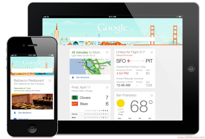
Coming from an Android device you’ll immediately recognize Google Now. The design scheme is left unchanged with simplistic UI elements, clean tile-like cards of information, the font, etc. but there is also an unmistakable iOS feel to the app which users might appreciate.
Design and usability
Google Now on iOS is accessible via the Google Search app – opening the app reveals the familiar Google search page but when you look closely at the bottom you’ll notice there’s a card showing. Tapping it will invoke the familiar Now interface but we’d recommend using a swipe up gesture, which gently fades Google Now into the screen flipping the Google logo – it’s a really cool transition and even the die-hard Android users at HQ gave it the thumbs up.
The Now interface is business as usual.It lists information that is relevant to you in cards, which you can scroll to view or swipeto dismiss. There’s no digging involved – Google Now gathers information it thinks you might appreciate by keeping track of your searches, location, etc.
For instance it knows which sports teams you’ve searched and gives you info on its recent results and upcoming games. Naturally you can also manually set the teams you are interested in. Google now also knows where you live and work thanks to Google Maps data and gives you information on the traffic along the route, in addition to detailed weather information for your current location. More impressively, Now senses when you’re abroad, and automatically gives you currency conversion rates and translation tips.
The more you use Google Now the more cards you’ll see on a daily basis. At first you start off with the weather card, perhaps a sports scores card and the traffic information.
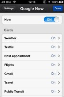
The sample cards interface is Coverflow-like and shows all the different types of cards.
You can naturally search Google through Google Now but the best way to go is voice search. It covers a myriad of different languages (many more than Siri does) and gives you results in highlighted boxes above the normal website results.
Unfortunately, Google Now doesn’t speak to you, like it does on Android. This isn’t as major as it might sound because the actual results still appear on the screen – just as on any droid smartphone. Otherwise voice recognition is superb and a step up from Apple’s Siri, which constantly mistakes NBA for MBA – a problem I didn’t have once with Google’s Voice Search.
Compared to Android
Google Now on Android differs very slightly from the iOS app in terms of looks. In terms of functionality, however, the two apps are quite far apart. Google Now on Android does speak to you and it can also do stuff with the underlying OS. For instance creating a calendar appointment is a breeze – while on iOS that’s something reserved for Siri only. It takes a little from the experience.
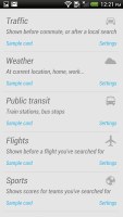
Then there’s the sample cards interface, which is a list on Android, which upon a tap invokes the card. It’s a more functional and easier to navigate interface but just isn’t as sleek looking as the Cover Flow-like interface on the iOS version.
The problem with Google Now for iOS is that it can’t truly communicate with the OS underneath. Apple has done a fine job of isolating its own platform from intruders like Google Now (and other Google services like Maps, Gmail, etc.). So in order for Google Now to gather the needed information you need to use it constantly to search (or just do it from a browser), use Google Maps instead of Apple Maps for directions, etc.
It’s not the ideal port, but it’s still nice to have something to challenge Siri and bring a whole new level of experience to the platform.
And finally, here’s a video for good measure.
Featured
Categories
- Mobile phones
- Mobile software
- Mobile computers
- Rumors
- Fun stuff
- Various
- Android
- Desktop software
- Featured
- Misc gadgets
- Gaming
- Digital cameras
- Tablets
- iOS
- Desktop computers
- Windows Phone
- GSMArena
com - Online Services
- Mobile Services
- Smart Watches
- Battery tests
- BlackBerry
- Social Networks
- Web Browsers
- Portable Players
- Network Operators
- CDMA
- Windows
- Headphones
- Hands-on


 Lenovo A7000 Preview
 Benchmarking Asus ZenFone 2 ZE551ML with Intel Atom Z3580 SoC and 4GB of RAM
 Xiaomi Mi 4i battery life test
 Samsung Galaxy S6 updated to Android 5.1.1: exploring the differences on video
 Oppo R7 battery life test
Comments
Rules for posting