Firefox gets a new logo
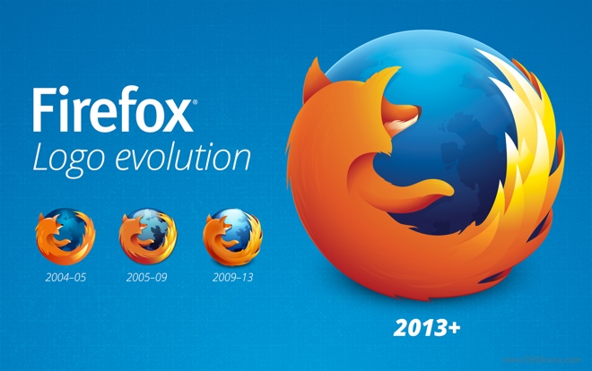
The Mozilla Firefox logo is one of the more recognizable logos around the world, at least to those of us who have been fortunate enough to use a computer. Been around as long as the browser itself, the logo only went through subtle changes since the browser was first released back in 2002.

Mozilla has now revealed what would be the third redesign of the famous logo. One look at the new logo and it’s clear that the designers have gone for a flatter look, as is the current trend in design. Most notably, the high gloss from the globe has been reduced considerably in favor of subtle gradient. The fox also loses the pronounced streaks on the back for a less detailed deep orange surface.
There are some other minor changes as well, such as a cleaner tail section for the fox, reflection of the light on the fox’s nose, redesigning of the continents on the globe and for once, a proper shoulder for the arm so it doesn’t look like it’s jutting out from the chest.
The new logo remains as recognizable as the previous one but the redesign breathes new life into it and makes it more relevant in modern times.
Featured
Categories
- Mobile phones
- Mobile software
- Mobile computers
- Rumors
- Fun stuff
- Various
- Android
- Desktop software
- Featured
- Misc gadgets
- Gaming
- Digital cameras
- Tablets
- iOS
- Desktop computers
- Windows Phone
- GSMArena
com - Online Services
- Mobile Services
- Smart Watches
- Battery tests
- BlackBerry
- Social Networks
- Web Browsers
- Portable Players
- Network Operators
- CDMA
- Windows
- Headphones
- Hands-on
 Lenovo A7000 Preview
 Xiaomi Mi 4i battery life test
 Benchmarking Asus ZenFone 2 ZE551ML with Intel Atom Z3580 SoC and 4GB of RAM
 Hot or Not: Android M, iOS 9 and Watch OS 2.0
 HTC One M9+ preview
Comments
Rules for posting