Apple’s court documents compare iOS icons with Samsung’s TouchWiz, show the striking similarities
One of the good things about the Apple vs. Samsung legal kerfuffle is that it has often resulted in a lot of interesting and never before seen information leaking to the public through court document.
The latest document from Monday’s trial does not show something new but asserts what we have already seen before. That Samsung took heavy inspiration from Apple’s iOS for the TouchWiz UI.
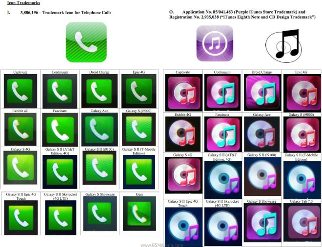
The images below compare icons from Apple’s iOS with multiple variations that Samsung “created” for different devices running TouchWiz. As you can see, the similarities are striking to anyone with a working pair of eyes. And before you make the lame argument that that there is no other way to design these icons, I would just direct you towards icons on other Android phones running stock Android or HTC Sense, that look nothing like Apple’s icons.
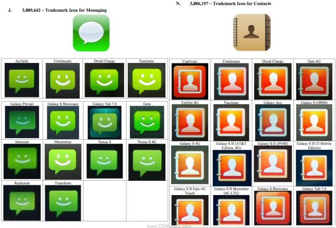
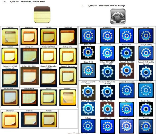
Clearly then Samsung went out of its way to make these icons look like Apple’s, something they have tried to correct in their latest Nature UX, which has substantially different looking icons compared to both, Apple’s and their own previous designs.
Samsung better has some exceptionally talented lawyers otherwise things are looking bleak for them.
Featured
 Hot or Not: Android M, iOS 9 and Watch OS 2.0
 Your verdict on Android M, iOS 9 and Watch OS 2.0
 Lenovo A7000 Preview
 Xiaomi Mi 4i battery life test
 HTC One M9+ preview
Categories
- Mobile phones
- Mobile software
- Mobile computers
- Rumors
- Fun stuff
- Various
- Android
- Desktop software
- Featured
- Misc gadgets
- Gaming
- Digital cameras
- Tablets
- iOS
- Desktop computers
- Windows Phone
- GSMArena
com - Online Services
- Mobile Services
- Smart Watches
- Battery tests
- BlackBerry
- Social Networks
- Web Browsers
- Portable Players
- Network Operators
- CDMA
- Windows
- Headphones
- Hands-on
Comments
Rules for posting