Apple vs Android – an infographic on the rivalry
The rivalry between Apple’s iOS and Google’s Android has been an important factor in shaping the smartphone ecosystem the last couple of years.We’ve covered the whole ordeal in many articles here on GSMArena but there’s always more room for perspective.
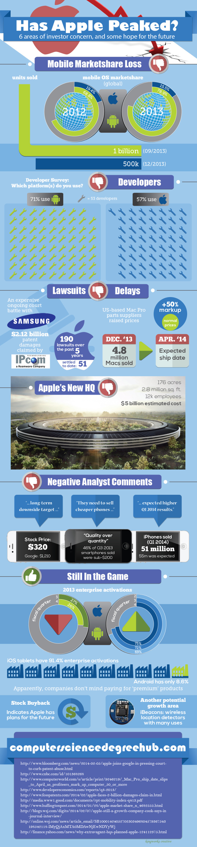
The people over at ComputerScienceDegreeHub.com have concocted an inforgraphic based on various sources that depicts Apple viewed in 6 areas of investor concern, giving some numbers and facts.
The infographic shows the mobile marketshare war between Apple and Android and how it has changed in the last two years – 2012 and 2013. iOS’s share going down and Android’s going up.
Next up is an interesting perspective – developer interest and what OS developers are using. Moving on to lawsuits and their effect on investors, Apple’s upcoming multi-billion headquarters and more. Analysts are also involved in the infographic concerning their desire for cheaper iPhones, lower than estimated device sales and dropping stock prices. In the infographic one analyst quoted has predicted a steep decline of Apple’s current stock price of $590 to $320, which is a tad drastic in our minds.
Looking at the infographic it seems Apple’s iPad is the only true bright spot for the company. But here’s the thing – investors and analysts don’t reflect the full picture. Analysts deal their predictions based on a plethora of factors but sometimes get it completely wrong or over-exaggerated.
Anyway, here’s the infographic itself.
Featured
 HTC One M9+ preview
 Hot or Not: Android M, iOS 9 and Watch OS 2.0
 Oppo R1x battery life test
 Lenovo A7000 Preview
 Your verdict on Android M, iOS 9 and Watch OS 2.0
Categories
- Mobile phones
- Mobile software
- Mobile computers
- Rumors
- Fun stuff
- Various
- Android
- Desktop software
- Featured
- Misc gadgets
- Gaming
- Digital cameras
- Tablets
- iOS
- Desktop computers
- Windows Phone
- GSMArena
com - Online Services
- Mobile Services
- Smart Watches
- Battery tests
- BlackBerry
- Social Networks
- Web Browsers
- Portable Players
- Network Operators
- CDMA
- Windows
- Headphones
- Hands-on
Comments
Rules for posting