Apple no longer calls its Maps the most beautiful and powerful ever
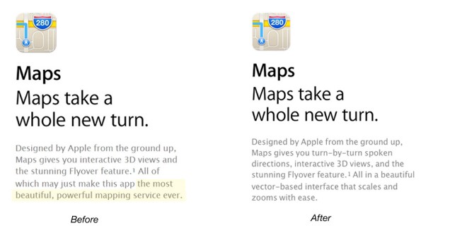
Hot on the heels of the new alternative Maps apps section in the AppStore, Apple has also toned down the elated iOS6 Maps app copy as keen visitors to its website have spotted.

As the screenshot conveniently points, the previous copy called the new Maps app “the most beautiful, powerful mapping service ever”. The new wording turns the attention to another key feature – “the beautiful vector-based interface that scales and zooms with ease” and certainly takes a more modest stance.
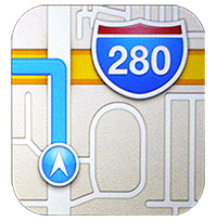
I wonder when is Apple going to change the messed up icon as well.

It clearly shows a navigation route making a sharp left off a bridge.
Featured
Categories
- Mobile phones
- Mobile software
- Mobile computers
- Rumors
- Fun stuff
- Various
- Android
- Desktop software
- Featured
- Misc gadgets
- Gaming
- Digital cameras
- Tablets
- iOS
- Desktop computers
- Windows Phone
- GSMArena
com - Online Services
- Mobile Services
- Smart Watches
- Battery tests
- BlackBerry
- Social Networks
- Web Browsers
- Portable Players
- Network Operators
- CDMA
- Windows
- Headphones
- Hands-on
 Oppo R1x battery life test
 Your verdict on Android M, iOS 9 and Watch OS 2.0
 Xiaomi Mi 4i battery life test
 Benchmarking Asus ZenFone 2 ZE551ML with Intel Atom Z3580 SoC and 4GB of RAM
 Hot or Not: Android M, iOS 9 and Watch OS 2.0
Comments
Rules for posting