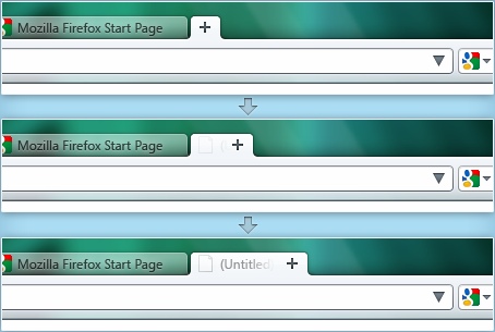
A video mockup shows the future of the Firefox interface and it’s animated
The guys are serious about designing the perfect UI and they have put a lot of effort into various experiments. Firefox 4 is a long way from getting released but its UI has gone through several mockups already and now they’re introducing a new element – eye-candy animation.

The Mozilla Wiki lists several good reasons for using animation, like movement naturally attracting the eye or make the browser more visually appealing. Since a lot of the actions and components in the user interface correspond to real-life objects and manipulating them, animating these actions and components to behave like their real-life counterparts could also help usability by making them more natural.
Stephen Horlander, the Product Visual Designer at the Mozilla Corporation, has posted two videos on his blog showing how opening a new tab and tearing off a tab might look like. It’s interesting to note that the videos don’t use Flash – they play in a HTML5 player.
And one last bit – check the source code of the pages with the videos. You only need a single line of code to embed a video – it’s as easy as embedding an image. I’m really beginning to like this whole HTML5 business.
Featured
Categories
- Mobile phones
- Mobile software
- Mobile computers
- Rumors
- Fun stuff
- Various
- Android
- Desktop software
- Featured
- Misc gadgets
- Gaming
- Digital cameras
- Tablets
- iOS
- Desktop computers
- Windows Phone
- GSMArena
com - Online Services
- Mobile Services
- Smart Watches
- Battery tests
- BlackBerry
- Social Networks
- Web Browsers
- Portable Players
- Network Operators
- CDMA
- Windows
- Headphones
- Hands-on
 Lenovo A7000 Preview
 Oppo R1x battery life test
 Benchmarking Asus ZenFone 2 ZE551ML with Intel Atom Z3580 SoC and 4GB of RAM
 Hot or Not: Android M, iOS 9 and Watch OS 2.0
 HTC One M9+ preview
Comments
Rules for posting