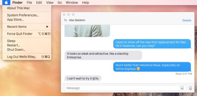
Apple allegedly planning to switch to San Francisco as default font for iOS and OS X
Apple has been working on its new font – San Francisco – for a while now and we saw it debut on the Apple Watch announced last year. But soon you might be seeing it as the default font on iOS and OS X, replacing the current Helvetica Neue.

San Francisco is a heavier typeset designed to emphasise visibility, especially on smaller displays of the Apple Watch. The font also scales well to larger displays and works quite well on iOS and OS X. In comparison, many people find the current Helvetica Neue to be quite light and hard to read, especially on iOS. The switch to San Francisco is supposedly the solution to this problem.
According to the sources at 9to5Mac, Apple might introduce the new font for iOS 9 and OS X 10.11 at WWDC this year. If you look closely, you’d notice that even the hardware keyboard on the new MacBook has the text on the keys printed in San Francisco. The font is said to work great on Retina displays, although it might not look so hot on non-Retina displays, which is also an issue with the current Helvetica Neue.
WWDC is next month so we’ll know then if Apple decides to switch or continues using the current typeset.
Featured
Categories
- Mobile phones
- Mobile software
- Mobile computers
- Rumors
- Fun stuff
- Various
- Android
- Desktop software
- Featured
- Misc gadgets
- Gaming
- Digital cameras
- Tablets
- iOS
- Desktop computers
- Windows Phone
- GSMArena
com - Online Services
- Mobile Services
- Smart Watches
- Battery tests
- BlackBerry
- Social Networks
- Web Browsers
- Portable Players
- Network Operators
- CDMA
- Windows
- Headphones
- Hands-on
 Oppo R1x battery life test
 Benchmarking Asus ZenFone 2 ZE551ML with Intel Atom Z3580 SoC and 4GB of RAM
 HTC One E9+ performance benchmarks
 Oppo R7 battery life test
 Your verdict on Android M, iOS 9 and Watch OS 2.0
Comments
Rules for posting