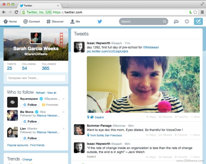
Twitter revamps its web client
Twitter has completely revamped its web interface to bring it closer to the look and feel of its iOS and Android applications. The new design comes with a cool new white navigation bar at the top, replacing the dark hue.

Twitter has retained all its navigational elements such as home, connect, discover and user profile in its new tweak, but the overall design of the micro-blogging site is a lot lighter now.
Furthermore, the positioning of the profile picture and the background image has been slightly moved towards the upper left side of the layout. Lastly, with the newest update, you can add elegance to your profile by using accent colors.
The popular social networking website said in a tweet “We’re now rolling out a refreshed twitter.com reflecting the look & feel of our iOS & Android apps”.
Featured
Categories
- Mobile phones
- Mobile software
- Mobile computers
- Rumors
- Fun stuff
- Various
- Android
- Desktop software
- Featured
- Misc gadgets
- Gaming
- Digital cameras
- Tablets
- iOS
- Desktop computers
- Windows Phone
- GSMArena
com - Online Services
- Mobile Services
- Smart Watches
- Battery tests
- BlackBerry
- Social Networks
- Web Browsers
- Portable Players
- Network Operators
- CDMA
- Windows
- Headphones
- Hands-on
 Xiaomi Mi 4i battery life test
 HTC One E9+ performance benchmarks
 Samsung Galaxy S6 updated to Android 5.1.1: exploring the differences on video
 Hot or Not: Android M, iOS 9 and Watch OS 2.0
 HTC One M9+ preview
Comments
Rules for posting