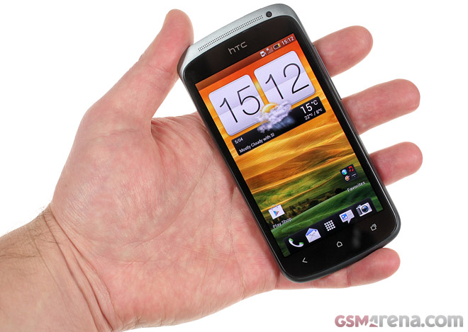
HTC One S pays us a visit to pose for the camera in a hands-on video
HTC’s new direction with the One series of Android smartphones keeps reminding us of the Three Musketeers. The HTC One S, however, has abandoned the “all for one, one for all” motto to give our office a visit and pose for the camera for your viewing pleasure.

HTC’s engineers have spent a ridiculous amount of time working out the finest details on all members of the One series family, but the One S got a big share of their love, it seems. With its gradient anodized aluminum unibody, which alone is quite a faff to achieve, thin waistline and Sense 4.0 in charge of the UI, the One S properly heats up the battle in the upper mid-range class.
Speaking of a thin waistline, the One S is the slimmest smartphone HTC has ever put into production, measuring at 130.9 x 65 x 7.8 mm. It feels great in hand and the blue paint job around the rim of the camera makes it that much cooler.
The One S continues its winning streak with the 4.3-inch Super AMOLED screen at the front, rocking qHD resolution. Below it are the usual three buttons for Ice Cream Sandwich in a capacitive form. Under the hood, the One S gets its punch from the latest Qualcomm S4 chipset with two Krait cores ticking at 1.5GHz and 1GB of RAM. At the back, there’s an 8MP camera with LED flash.
Running on Ice Cream Sandwich, the One S, as well as the rest of the One series line-up, introduces Sense 4.0. HTC have made lots of adjustments and optimizations to the Sense user interface without taking it away from its roots.
You can still launch apps from the lockscreen and add widgets to seven different homescreens. But for what HTC has improved and streamlined, they’ve also removed quite a bit. Gone is the fancy 3D carousel, which shows up when you spin the homescreens fast and most of the graphics enhancements on various user interface elements. You can also remove some of the available homescreen panes too.
And that’s good riddance, as now Sense UI is faster and lighter on its feet, which users will appreciate. Everything else is in familiar Ice Cream Sandwich fashion. From the top notification drawer, through the bottom app dock, holding up shortcuts to different apps, to the apps menu. The latter, unlike ICS, doesn’t hold Widgets. They are accessed after a long press on the homescreen, like most Android users are used to.
HTC Apps like weather, stocks and notes have updated looks, while the extra new widgets will always be welcomed. The task switcher introduced in Ice Cream Sandwich is designed with a 3D look, but works the same as you’d expect. Everything else from Browser to Gallery is working without any hiccups, leaving the user with a pleasurable experience.
Finally, here’s our quick overlook of the One S and the new Sense 4.0 user interface.
Stay tuned for our full-size review coming soon.
Featured
Categories
- Mobile phones
- Mobile software
- Mobile computers
- Rumors
- Fun stuff
- Various
- Android
- Desktop software
- Featured
- Misc gadgets
- Gaming
- Digital cameras
- Tablets
- iOS
- Desktop computers
- Windows Phone
- GSMArena
com - Online Services
- Mobile Services
- Smart Watches
- Battery tests
- BlackBerry
- Social Networks
- Web Browsers
- Portable Players
- Network Operators
- CDMA
- Windows
- Headphones
- Hands-on


 Benchmarking Asus ZenFone 2 ZE551ML with Intel Atom Z3580 SoC and 4GB of RAM
 Your verdict on Android M, iOS 9 and Watch OS 2.0
 Hot or Not: Android M, iOS 9 and Watch OS 2.0
 Xiaomi Mi 4i battery life test
 Samsung Galaxy S6 updated to Android 5.1.1: exploring the differences on video
Comments
Rules for posting