Windows 8 Consumer Preview highlights
Microsoft concluded its Windows 8 Consumer Preview demonstration at the Mobile World Congress in Barcelona and now it’s time to get to the essentials of what the Consumer Preview brings to the table.
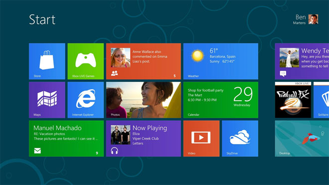
While there are many new things surrounding it, like its flawless work on various SoCs, eight second boot-up time and more, we are going to concentrate on the new sides of the software. Let’s dig in.
Performance Boost and under-the-hood workings
Windows 8 has the hard job of working on an array of different devices. At the press event in Barcelona, Steven Sinofsky demonstrated a plethora of tablets, ultrabooks, regular laptops, all-in-one PCs, desktops and even an 82-inch touch PC, supporting up to 100 multiple fingers at once.
As you’d imagine being able to run and provide the same buttery smooth experience on powerhouse desktop PC and then do the same on a laptop or an ultrabook isn’t the easiest job in the world. That’s why the guys at Redmond have tweaked the most core concepts of how Windows 8 operates and have made it light on its feet.
An example of their work is the fewer background processes, tasks and services that Windows 8 is running. This means the OS is using less CPU computing power and requires fewer threads. Also, applications which are not currently used don’t necessarily have to be closed, because thanks to the new way Windows 8 manages them, they don’t consume any processing time at all.
What all this boils down to is smoother user interfaces and less lag when switching from app to app. I can only assume that because of the affordable prices of RAM these days, Microsoft is betting the handling of the idle states of apps on it. I am no software engineer, so whatever the case may be, the fact remains that the real software gurus at Microsoft have done what they were expected to do – make Windows 8 lighter on its feet.
This allows for you to focus on…
… Applications (and the Microsoft Store)
I don’t suppose you, dear reader, have been living under a rock for the last couple of years so I am assuming you are fully aware that the world has gone app-berserk. Everyone these days is counting on apps for doing their work.
So, it was about time Microsoft came out with a proper way of browsing for applications with the release of the Microsoft Store in the Consumer Preview of Windows 8. Just like any other place where applications are offered free or not, the Microsoft Store shares the same basic features with them. You can browse for apps which are sorted by categories for better organization, or just type an app and search for it. The home page of the MS Store acts like a spotlight where you can see the latest and trending applications.
And what Microsoft are doing to step up into the application business is very interesting. First and foremost, they are making all the available and future apps, added to the MS Store completely and utterly free.
Microsoft also previewed some of the included applications in the Consumer Preview of Windows 8. One such app is the revamped People’s app, which, to be honest, I don’t use. At all. But this is about to change, thanks to the redesigned one for Windows 8. It’s updated and looks modern thanks to the Metro UI interface.
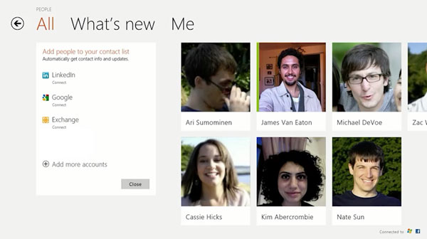
There are also Mail and Messenger which are straightforward. The latter can connect to Facebook’s chat or to Microsoft’s Messenger. Admittedly, what made the most impact on me was games. Specifically, Cut the Rope. As you know its life began as an iOS game, but due to its success quickly got its Android port out. Now, games written in different languages, be it Java, C++, C# and even HTML5 can be easily ported to work on Windows 8. Microsoft say feature this took them more than 5 months, but undoubtedly it’s worth it, because developers needn’t rewrite their applications from scratch just to support yet another platform.
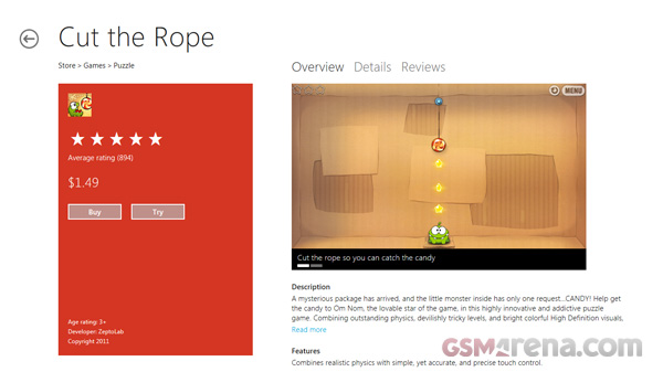
Moving on to the Consumer Preview at hand, there are a lot of new things you can do with apps. Most, if not all of the new features related to apps can now be controlled via various…
… Gestures
After all, don’t forget that the new Windows release is equally as important for touch devices as it is for mouse and keyboard. This is where gestures come in. Microsoft are introducing a whole lot gestures available at your disposal for controlling different aspects of the operating system, mainly with apps.
For example, you have something called a Charm bar, which always sits on the right part of the screen. It can be accessed either via a swipe from the right part of the screen (on a tablet) or by placing the mouse on the right side of the screen.
The Charm bar can hold one of these commands / shortcuts: Start, Share, Search, Devices and Settings. Here’s a quick run down of what each of them does.
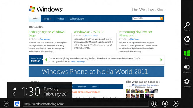
- Start: the Start button, as you would imagine, takes you to the Home screen, sporting the Metro UI look.
- Share: depending on the app and what sharing services you’ve installed / enabled, this button will bring them accordingly.
- Search: bring up the good ol’ search functionality in Windows 7
- Devices: pops up a list of all connected external or internal devices to the current system
- Settings: is the quick-and-easy way of getting to a top-level list of some of the available settings. Don’t mistake it with the current Control Panel in window, because they are not the same thing.
And this being touch-centric OS, there are top and bottom drawers as well. They are accessed by swiping from the top or the bottom, or with a right mouse click. Their purpose is to hold app-specific information. For example Internet Explorer 10 will utilize them by placing opened tabs in the top bar and navigation buttons, adress bar and other icons on the bottom bar.
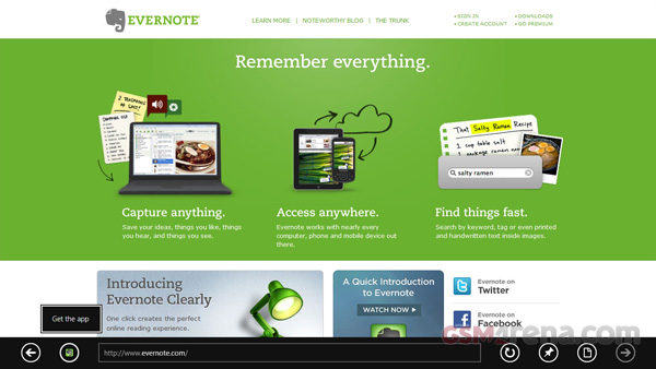
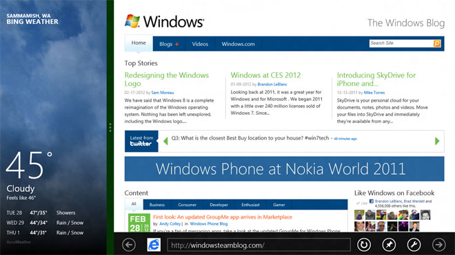
And, finally, the only unused part of the screen is the left one. Not so fast. Microsoft has decided to fill it with a multitasking bar and unlike the other drawer bars, it can take up different amounts of space. If you drag it a little, only one currently running app will show, drag it a bit more and it snaps to the left quarter of the screen. And if you dare to drag it all the way to the right, it takes up the whole screen to make all the currently running apps visible.
SkyDrive – the rival to iCloud
Watching from how the other kids are doing it, Microsoft doesn’t want to stay far behind. It launched SkyDrive a while ago, but nobody was really using it and it couldn’t generate even part of Dropbox’s hype. Now, though, is its time to shine with Windows 8.
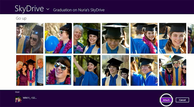
SkyDrive is acutely integrated into the Windows 8 experience. It can sync you address book, photos, whatever you put into your SkyDrive box or even data used by other applications, which they might need for later. All it takes is a simple sign-in and SkyDrive will be lock and loaded.
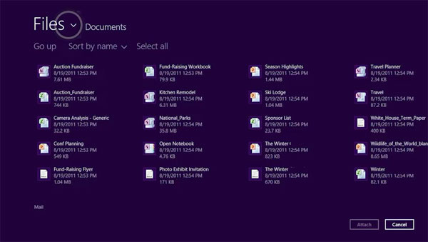
Just as iCloud, SkyDrive syncs the same data across various Windows 8 devices. This means you can sync your Windows 8 settings, taskbar, themes or even languages from one machine to another.
This brings us to the…
… Little things
The overall feel of Microsoft’s new Windows baby feels slightly refreshed. Things such as the updated Task Manager are great example. It’s more streamlined than before and, according to my eye, is much more engaging making you not hate it every time you open it.
Or even the simple action of copying a file from one place to another feels like a special occasion. The window which displays the process is now pimped out with a fancy graph which shows you the history of the transfer rate speed. Heck, you can even now pause the copying of a file and resume it later, for whatever reason.
Microsoft has also thrown in system-wide spellchecking, which means you don’t have to rely on Firefox plugins or other various pieces of software to get the job of checking the words you write.
Those were my first impressions of the Windows 8 Consumer Preview. For the quick time I got to play with it for the purposes of this article those were the main things that got my attention. I am sure as I continue to use it as my daily OS, it’ll surprise me even more. And I have the sneaking suspicion those would be good, not bad surprises.
Featured
Categories
- Mobile phones
- Mobile software
- Mobile computers
- Rumors
- Fun stuff
- Various
- Android
- Desktop software
- Featured
- Misc gadgets
- Gaming
- Digital cameras
- Tablets
- iOS
- Desktop computers
- Windows Phone
- GSMArena
com - Online Services
- Mobile Services
- Smart Watches
- Battery tests
- BlackBerry
- Social Networks
- Web Browsers
- Portable Players
- Network Operators
- CDMA
- Windows
- Headphones
- Hands-on
 Hot or Not: Android M, iOS 9 and Watch OS 2.0
 Samsung Galaxy S6 updated to Android 5.1.1: exploring the differences on video
 Lenovo A7000 Preview
 HTC One M9+ preview
 Benchmarking Asus ZenFone 2 ZE551ML with Intel Atom Z3580 SoC and 4GB of RAM
Comments
Rules for posting