Upcoming Play Store update with Material Design revealed
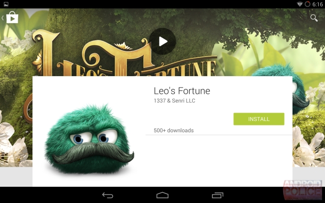
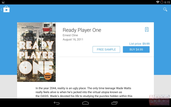
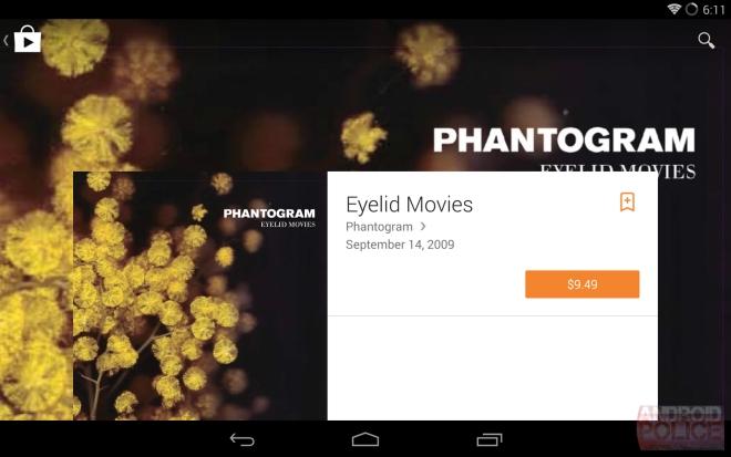
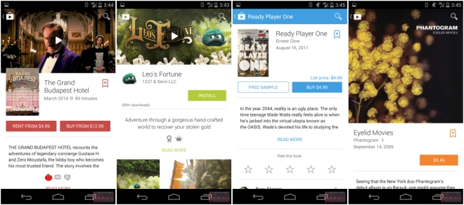
Android Police have revealed some screenshots that showcase what the next major version of Play Store on Android is going to look like. The design changes are based on the Material Design language that Google introduced at I/O this year.

What you see here are just product pages for all the different categories and how they will look on tablet and smartphones.

As you can tell, the Material Design guidelines put a lot of importance on having large hero images behind the product description, whenever available. In some cases, such as with games and movies, you can tap on the image to play the trailer.

The design is more spaced out, particularly on the tablet, with a significantly lower information density, at least when you first open the product page. On the smartphone, things are more or less the same, just rearranged for a cleaner look.

Google has been slowly changing its current apps for Material Design even before Android L has been released for a smoother transition. We have already seen the Google+, Google Sheets and Google Docs apps benefit from this redesign. The Play Store update is much more significant in comparison is therefore likely to arrive later along with Android L.

It’s important to note what you see above are from pre-release software and is not final. The design could change by the time it is actually released.
You’ll find lot more screenshots in the link below.
Featured
Categories
- Mobile phones
- Mobile software
- Mobile computers
- Rumors
- Fun stuff
- Various
- Android
- Desktop software
- Featured
- Misc gadgets
- Gaming
- Digital cameras
- Tablets
- iOS
- Desktop computers
- Windows Phone
- GSMArena
com - Online Services
- Mobile Services
- Smart Watches
- Battery tests
- BlackBerry
- Social Networks
- Web Browsers
- Portable Players
- Network Operators
- CDMA
- Windows
- Headphones
- Hands-on
 Your verdict on Android M, iOS 9 and Watch OS 2.0
 Xiaomi Mi 4i battery life test
 Lenovo A7000 Preview
 Hot or Not: Android M, iOS 9 and Watch OS 2.0
 HTC One M9+ preview
Comments
Rules for posting