SPB Mobile Shell 3.5 for Symbian released, our review is inside
SPB Software has just announced the availability of their SPB Mobile Shell 3.5 user interface for Symbian devices. One of the most popular smartphone platforms in the world has so far struggled with providing good user-experience to touch-loving users so it was about time that someone did something about it.
Indeed the SPB Mobile Shell 3.5 will transform your Symbian 5th edition running device beyond recognition and having played with it for a week I can confirm that this is a change for the better.
Key features
- Up to 5 panes of Homescreen estate to be filled with widgets
- Vast customization options
- Plenty of eye candy
- Two easily interchangeable layouts for the homescreen
- A refreshed task manager that is much easier to use
Main disadvantages
- Pricey
- Newcomers might need some time to get used to the arrangement
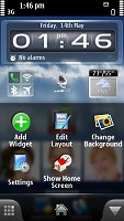
Everyone demanding the ultimate level of customization should definitely have a look at the SPB Software latest offering. It will give a choice between one, three and five panes for your homescreen, which can be filled with all kinds of contacts and apps shortcuts and widgets.
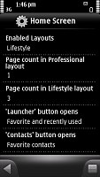
The homescreen settings
Furthermore you get to pick the size and type of each icon, as well as the spacing between the homescreen inhabitants. For example each contact photo that you bring to the homescreen can be either a small, medium or you could just select the text option and see the name of the contact, rather than their photo. Next you get to pick the icon’s default behavior – it can send you to the contact’s info, the SMS or MMS editor or just dial the contact straight away.
Next come application shortcuts – those come in five flavors (small, big, text, box or big box). The difference between box and non-box options is in the appearance of the shortcut, while selecting text, as you probably guessed, will show the name of the app, rather than its icon on the homescreen.
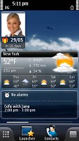
The final items that you can place on the homescreen pane(s) are the 22 widgets that the SPB Mobile Shell offers. There are several clocks, a picture frame, connectivity controllers (telephony, Wi-Fi and Bluetooth switches as well as Wi-Fi manager for connecting to a new network), organizer items (calendar, agenda, tasks etc.), weather widget etc.
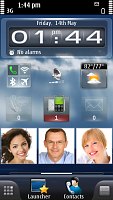
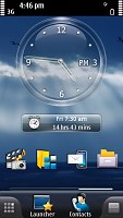
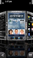
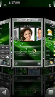
There are up to five screens available to be filled with app and contact shortcuts and widgets
All those options are pretty much standard for, say Android users but Symbian owners have hardly been able to modify their screen too much so it’s in fact a huge step forward for them.
Another option, initially associated with Android, but now becoming standard on all platforms is the panoramic perspective wallpaper, which scrolls slower than the icons on top of it. This gives a 3D look to your homescreen that I really appreciate.
You can customize your wallpaper easily
The final thing about the homescreen worth mentioning is that there are two layouts available. Those are in fact two advanced themes that allow you to have two different set-ups (number of screens, widgets and shortcuts) for the homescreen and alternate them by a couple of clicks only. So if you use one set of widgets when you are in the office and another when at home, you can easily toggle the two layouts.
Moving on to the four buttons docked at the bottom of the screen in the SPB Mobile Shell. The rightmost of them opens the contextual menu. Next comes the contacts button, which opens a menu, consisting of three tabs and you can pick which one to be the default.
The rightmost key brings up the contextual menu
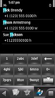
Those tabs are call log, favorite contacts and contacts list. In favorite contacts you can once again arrange a selection of contacts, each with a different icon size. The call log gives you an aggregated view of your recent communications, while the contacts list is much like a basic-looking phonebook which can be searched by typing on the T9-enabled multitap virtual keypad or by flick scrolling.
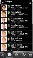

The contacts menu
The favorite contacts tab also offers an alternative view dubbed contacts carousel.
Contacts carousel
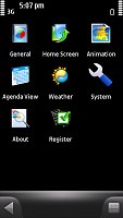
Next comes the Launcher, which is a key part of the SPB Mobile Shell. It is actually replacing the Symbian main menu giving you three icons on top (they, too, can be replaced if you want) – the first opens an aggregated view of all the applications you have installed on your phones. It’s rather lengthy and not quite easy to navigate if you have lots of those but flat menus seem to be all the rage these days.
SPB Mobile Shell brings all your apps together
The middle icon at the top of the Launcher screen takes you to the settings menu, while the third opens up the redesigned task manager. The good old Symbian shortcut with pressing and holding the menu key also works for accessing that, by the way.
The settings menu and the redesigned task manager
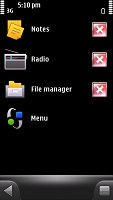
The final button at the bottom of the homescreen takes you to a kind of a shortcut menu, which displays all the panes that I told you about so far. It can appear in either tile view (much like the helicopter view mode of the HTC Sense UI) or carousel view and can help you find a particular screen which you are unable to dig through the launcher.
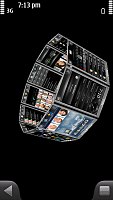
The carousel view is certainly nice to look at but hardly as practical as the standard tile view
The 3D effects of the carousel view that you see at the third screenshot above is seemingly only available for the Nokia N97 as I couldn’t get it on the Nokia 5800 XpressMusic, used for the review.
Lastly, I have to mention that the SPB Mobile Shell offers several transition effects for when browsing through menus. You can also choose whether or not it overrides the Symbian standard menu and task manager so in case you only want the homescreen you can have that too.
Final words
In conclusion I’d like to say that the SPB Mobile Shell fixes most of the shortcoming that the Symbian S60 5th edition has been rightfully criticized about. The menu navigation is rather different from the stock Symbian so it might be a bit hard for newcomers to swallow but once you know you way around it much faster and more convenient to use.
I have already made my decision and I am keeping the Mobile Shell as my default user interface. It feels stable, doesn’t cause any additional lags and leads the vanilla S60 5th edition UI in terms of customization options and usability by a country mile. It’s even better featured with all those widgets.
The question remains if the SPB Mobile Shell is worth the (rather high) asking price. Well that depends on how much you value the user experience your phone gives you and what you are currently using. The N97 offers some widgets so its users will get less new features for their cash. The Nokia 5530 on the other hand doesn’t have the kinetic scrolling working everywhere so it will be more of an improvement for its users. In any case you can download the trial version and give it a test before forking out the cash and I advise you to do so.
Featured
 Oppo R1x battery life test
 Oppo R7 battery life test
 Lenovo A7000 Preview
 Xiaomi Mi 4i battery life test
 Samsung Galaxy S6 updated to Android 5.1.1: exploring the differences on video
Categories
- Mobile phones
- Mobile software
- Mobile computers
- Rumors
- Fun stuff
- Various
- Android
- Desktop software
- Featured
- Misc gadgets
- Gaming
- Digital cameras
- Tablets
- iOS
- Desktop computers
- Windows Phone
- GSMArena
com - Online Services
- Mobile Services
- Smart Watches
- Battery tests
- BlackBerry
- Social Networks
- Web Browsers
- Portable Players
- Network Operators
- CDMA
- Windows
- Headphones
- Hands-on
Comments
Rules for posting