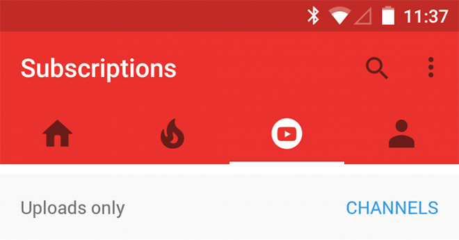
YouTube app design update may axe the hamburger menu
Google has been tweaking its Android apps with the Material Design philosophy and some radical changes are in pipeline. For instance, a new build of YouTube app hints that Google will axe the famous Hamburger menu button.

The Android design guidelines always referred the Hamburger style menu as the Navigation Drawer. YouTube app design update brings more tabs instead of a navigation drawer. There are four tabs, Home, Trending, Subscriptions and Profile.
In past Google has changed the navigation menu animation several times before the final roll out. Since this is just another app build being tested out, we are not sure whether it is the final design.
Featured
Categories
- Mobile phones
- Mobile software
- Mobile computers
- Rumors
- Fun stuff
- Various
- Android
- Desktop software
- Featured
- Misc gadgets
- Gaming
- Digital cameras
- Tablets
- iOS
- Desktop computers
- Windows Phone
- GSMArena
com - Online Services
- Mobile Services
- Smart Watches
- Battery tests
- BlackBerry
- Social Networks
- Web Browsers
- Portable Players
- Network Operators
- CDMA
- Windows
- Headphones
- Hands-on
 HTC One M9+ preview
 Hot or Not: Android M, iOS 9 and Watch OS 2.0
 Oppo R1x battery life test
 Your verdict on Android M, iOS 9 and Watch OS 2.0
 HTC One E9+ performance benchmarks
Comments
Rules for posting