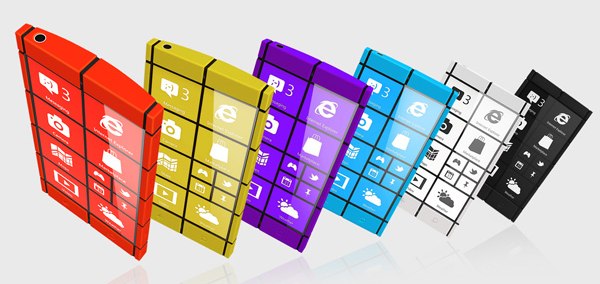
WP8 concept smartphone looks super cool, does a funny thing to the Windows button
Design is the one of the areas where we feel WP smartphones do pretty well. The Nokia Lumia 800 and 900 were considered by many (us included) as two of the best-looking handsets the industry has seen and virtually all of the recently announced WP8 handsets look equally as impressive.

Yet when we saw the latest concept design posted on Yanko Design, we just fell in love with it. Inspired by the Windows Phone UI, the colorful handset is not only a great looker, but also really different from anything we have seen so far.
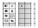
The only potential issue we see here is the relocated Windows button on the right side, which may or may not work in reality. Here’s to hoping that some of the Microsoft partners take an interest in the design and make it a reality, as we’d love to find out.
Featured
Categories
- Mobile phones
- Mobile software
- Mobile computers
- Rumors
- Fun stuff
- Various
- Android
- Desktop software
- Featured
- Misc gadgets
- Gaming
- Digital cameras
- Tablets
- iOS
- Desktop computers
- Windows Phone
- GSMArena
com - Online Services
- Mobile Services
- Smart Watches
- Battery tests
- BlackBerry
- Social Networks
- Web Browsers
- Portable Players
- Network Operators
- CDMA
- Windows
- Headphones
- Hands-on


 Your verdict on Android M, iOS 9 and Watch OS 2.0
 Xiaomi Mi 4i battery life test
 HTC One E9+ performance benchmarks
 Oppo R7 battery life test
 Samsung Galaxy S6 updated to Android 5.1.1: exploring the differences on video
Comments
Rules for posting