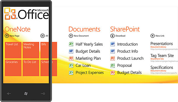
Windows Phone 7 UI on video – looks usable, flat
With any new UI design there’s a learning curve – like, how are those “hubs” on Windows Phone 7 supposed to work? Once you see it on video things get a lot clearer. And if you were worried how the newfangled OS will handle your corporate email – don’t, it’ll do it with smoothly animated ease…

This first video shows off, the Office Hub – it’s where you can access all your documents from a simple to use interface.
Office is now part of the OS and not a set of separate preloaded apps. The animations on Windows Phone 7 look pretty cool too, especially the “page flip” animation that breaks up the page into several segments and flips them separately.
I think the UI on Windows Phone 7 look a little flat though – especially the QWERTY, it’s barely recognizable as a separate element, it looks more like someone typed “q w e r t y” on the page.
Anyway, here’s the second video – it shows off the email and the organizer:
Shaded faux-3D buttons haven’t been cool in a while (say 10-15 years), but Windows Phone 7 is at the other extreme – it looks as flat as a sheet of paper. Sure, its simplicity is alluring, but until I play around with it, I can’t say if the lack of buttons is a good thing or a bad thing.
Featured
Categories
- Mobile phones
- Mobile software
- Mobile computers
- Rumors
- Fun stuff
- Various
- Android
- Desktop software
- Featured
- Misc gadgets
- Gaming
- Digital cameras
- Tablets
- iOS
- Desktop computers
- Windows Phone
- GSMArena
com - Online Services
- Mobile Services
- Smart Watches
- Battery tests
- BlackBerry
- Social Networks
- Web Browsers
- Portable Players
- Network Operators
- CDMA
- Windows
- Headphones
- Hands-on
 Benchmarking Asus ZenFone 2 ZE551ML with Intel Atom Z3580 SoC and 4GB of RAM
 Oppo R7 battery life test
 HTC One M9+ preview
 HTC One E9+ performance benchmarks
 Oppo R1x battery life test
Comments
Rules for posting