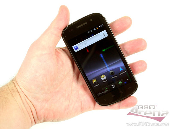
We’re not ninjas but we get to unbox the Google Nexus S and play with it too
Google Phone 2.0 is crashing on our couch for a few days and we thought we should give it the unboxing treatment. What did the Samsung-Google collaboration bring to the hardware? The curved SuperAMOLED screen is certainly a curiosity. And this is our first encounter with an unmodded Android 2.3 Gingerbread, is it better than Froyo and by how much?

Glad you asked, here are some initial impressions…
First off, the Google Nexus S feels a lot like Samsung’s Galaxy S – no surprise here as both are made from the same dough. I’m not a huge fan of the glossy black plastic used, but at least the phone is solidly built.
The curved display is interesting – you thumb is about equally stretched out when touching the top, middle and bottom section of the screen. The difference between it and a flat screen isn’t very pronounced but it’s one of those things that you get used to without even knowing it and then you can’t live without. More time spent with the Nexus S should answer that.
Anyway, enough babble, here’s the video you came to see:
Spotting the differences between the vanilla interfaces of Android 2.1 and 2.3 may be a challenge to some. The UI department was polished but there are no jarring differences. For example, the new text selection handles are new but manufacturers have shown us different (and maybe even better) implementations on the theme.
The two-finger gestures in Google Maps 5.0 and Google Earth are pretty cool (camera tilt and rotate) but they do get some getting used to. Once you get used to them, you’ll probably use them all the time to get a better look on a location.
Finally, the thing I played with the most – the screen switch-off animation. It emulates an old CRT TV and it’s really smooth and well animated. It may not impress some, but it made locking the screen much cooler than before.
We’re still working on the review, so there’s more to come.
Featured
Categories
- Mobile phones
- Mobile software
- Mobile computers
- Rumors
- Fun stuff
- Various
- Android
- Desktop software
- Featured
- Misc gadgets
- Gaming
- Digital cameras
- Tablets
- iOS
- Desktop computers
- Windows Phone
- GSMArena
com - Online Services
- Mobile Services
- Smart Watches
- Battery tests
- BlackBerry
- Social Networks
- Web Browsers
- Portable Players
- Network Operators
- CDMA
- Windows
- Headphones
- Hands-on
 Samsung Galaxy S6 updated to Android 5.1.1: exploring the differences on video
 HTC One M9+ preview
 Oppo R7 battery life test
 Lenovo A7000 Preview
 HTC One E9+ performance benchmarks
Comments
Rules for posting