Web version of Google’s Play Store receives a slight redesign
Google’s updated a lot of Android apps recently, but now it’s apparently the turn of its Web-based Play Store. This is in the process of receiving a slight redesign. The rollout seems to be gradual, but more and more people are reporting seeing the new Play Store on the Web.

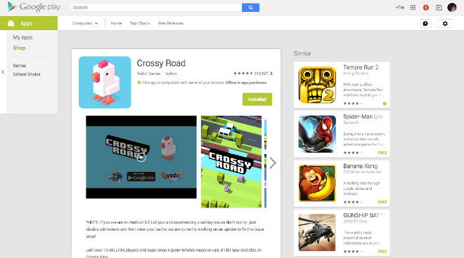
The main new thing unfortunately isn’t 100% adherence to Material Design. That’s still not available, but in the meantime the “Similar” apps list has been moved.
Whereas before you’d see this under the details about the app you’re viewing, from now on the Similar list will be to the right, as portrayed by the screenshot above. This has the potential to make the use of the Similar list jump up, since it’s a lot more visible now. Hopefully the new design will inspire people to explore some more apps.
Otherwise, though, the Play Store has remained unchanged. A Material Design makeover is now long overdue for the Web version of the store, so maybe that will be its next update.
Featured
Categories
- Mobile phones
- Mobile software
- Mobile computers
- Rumors
- Fun stuff
- Various
- Android
- Desktop software
- Featured
- Misc gadgets
- Gaming
- Digital cameras
- Tablets
- iOS
- Desktop computers
- Windows Phone
- GSMArena
com - Online Services
- Mobile Services
- Smart Watches
- Battery tests
- BlackBerry
- Social Networks
- Web Browsers
- Portable Players
- Network Operators
- CDMA
- Windows
- Headphones
- Hands-on
 Lenovo A7000 Preview
 HTC One M9+ preview
 Xiaomi Mi 4i battery life test
 Oppo R7 battery life test
 Samsung Galaxy S6 updated to Android 5.1.1: exploring the differences on video
Comments
Rules for posting