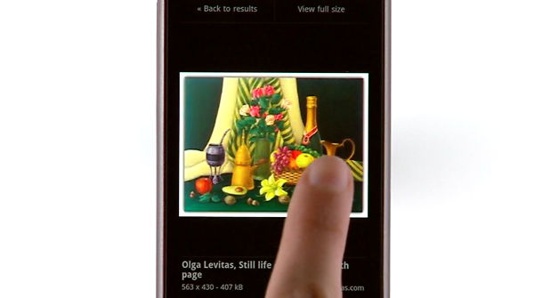
Updated Google Image search mobile page lets you browse images with finger swipes
Here comes yet another entry in the “Google updates its services, makes ‘em better” diary. They’ve updated the mobile version of Image search and it now looks very convincingly like a Gallery, sideways finger swipes for next/previous photo and all…

They’ve made a number of changes to the Google Image search mobile page. The thumbnails are now square, to fit as much as possible on the screen, and when viewing a photo, the buttons fade out after a few seconds – just like they do in built-in Gallery apps. Some optimizations were made too, to make the whole thing go faster.
Like I said, you can now use finger swipes to browse between photos and that also works for switching between pages. Single images are displayed big – they fill the screen and give you a better look at the image than the tiny thumbnails.
The new Image search page is available in 38 languages but only works on iPhones with OS version 3.0 or higher and Android 2.1 phones.
Featured
Categories
- Mobile phones
- Mobile software
- Mobile computers
- Rumors
- Fun stuff
- Various
- Android
- Desktop software
- Featured
- Misc gadgets
- Gaming
- Digital cameras
- Tablets
- iOS
- Desktop computers
- Windows Phone
- GSMArena
com - Online Services
- Mobile Services
- Smart Watches
- Battery tests
- BlackBerry
- Social Networks
- Web Browsers
- Portable Players
- Network Operators
- CDMA
- Windows
- Headphones
- Hands-on
 Lenovo A7000 Preview
 Samsung Galaxy S6 updated to Android 5.1.1: exploring the differences on video
 HTC One M9+ preview
 HTC One E9+ performance benchmarks
 Oppo R7 battery life test
Comments
Rules for posting