Upcoming Hangouts v4 for Android gets an early preview
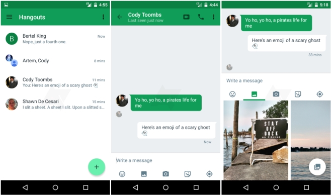
Google is working on an updated version of Hangouts for Android but before it gets released Android Police has some hands-on screenshots of the messaging application.

The focus here is on overhauling the entire interface design and pretty much every aspect of the UI has been changed even if it doesn’t seem to be the case at first glance.
On the main page that lists your conversations, the tab bar that separated the conversations from the contacts has been dumped in favor of a floating button that lists your recent contacts and lets you contact new ones. The previous + button at the top has been replaced with an action overflow button.
The chat view has also been improved, with more spaced out messages and a new row below the text box for shortcuts to emoji, gallery, camera, stickers, and location, things that were previously within the attachment button and required multiple taps. Google has also got rid of the super annoying orange bar that appeared on top of muted groups and just shows a snackbar message once that disappears.

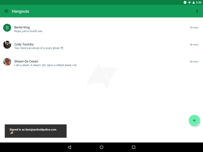
Unfortunately, even now the Android version of Hangouts does not have a proper tablet interface. The app will just stretch the living daylights out of the mobile app and completely waste all space on screen. In comparison, the iPad version of Hangouts has had a proper two pane UI for a long time now so it’s baffling why Google does not have it on Android.
There are also several other changes in v4. You can read more about it with screenshots in the link below.
Featured
Categories
- Mobile phones
- Mobile software
- Mobile computers
- Rumors
- Fun stuff
- Various
- Android
- Desktop software
- Featured
- Misc gadgets
- Gaming
- Digital cameras
- Tablets
- iOS
- Desktop computers
- Windows Phone
- GSMArena
com - Online Services
- Mobile Services
- Smart Watches
- Battery tests
- BlackBerry
- Social Networks
- Web Browsers
- Portable Players
- Network Operators
- CDMA
- Windows
- Headphones
- Hands-on
 HTC One E9+ performance benchmarks
 Your verdict on Android M, iOS 9 and Watch OS 2.0
 Xiaomi Mi 4i battery life test
 Oppo R7 battery life test
 Benchmarking Asus ZenFone 2 ZE551ML with Intel Atom Z3580 SoC and 4GB of RAM
Comments
Rules for posting