Twitter revamps filters in its mobile app
Twitter first introduced filters to its official app two years ago in December, now it’s time to actually make theм work well (the whole thing was a knee-jerk response to a soured relationship with Instagram).

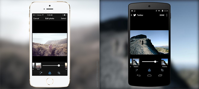
The official apps for Android and iOS (which are rolling out today) abandon the 3×3 grid display for filters for a more traditional approach.
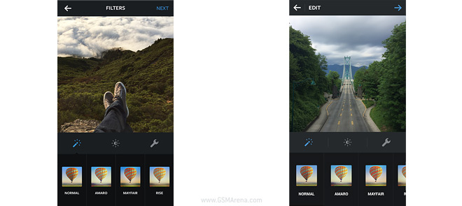
The tiny thumbnails didn’t offer much detail in how the filter will affect the photo, so instead a large preview will be shown, with a list of filters below. Each filter can be double-tapped to reveal a slider that adjusts the strength of the effect.

The whole thing looks very much like Instagram now (iOS and Android screenshots above).
Featured
Categories
- Mobile phones
- Mobile software
- Mobile computers
- Rumors
- Fun stuff
- Various
- Android
- Desktop software
- Featured
- Misc gadgets
- Gaming
- Digital cameras
- Tablets
- iOS
- Desktop computers
- Windows Phone
- GSMArena
com - Online Services
- Mobile Services
- Smart Watches
- Battery tests
- BlackBerry
- Social Networks
- Web Browsers
- Portable Players
- Network Operators
- CDMA
- Windows
- Headphones
- Hands-on
 Oppo R7 battery life test
 HTC One E9+ performance benchmarks
 Lenovo A7000 Preview
 Hot or Not: Android M, iOS 9 and Watch OS 2.0
 Oppo R1x battery life test
Comments
Rules for posting