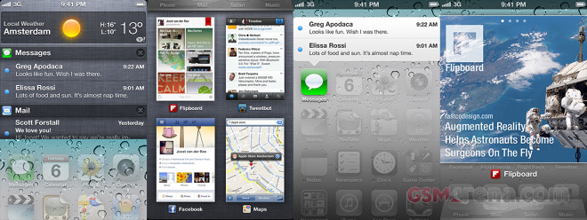
This fresh iOS UI concept shows what the iOS 6 should have been
We already know everything there is to know about the upcoming iOS 6 and let’s face it – it’s not going to be the jump Apple is trying to convince us it is. Everything is pretty much the same, with a few tweaks here and there, an overdue Facebook integration and extended Siri functionality.

The major new feature with the iOS 6 is the new Maps app, now with TomTom map data and, of course, the addition of navigation. Well, people do use Siri and navigation for sure, but those people have also been using this same tired iOS interface for 6 years now. They need something new, refreshing and they are not getting it this year.
Joost van der Ree published a few inspiring ideas that could easily fit into iOS, boosting the user experience along the way. Some of them are so obvious that makes you wonder why Apple didn’t come up with them in the first place. But maybe they have?
Here is the video describing the several new concepts:
I am particularly impressed by the notification center. If Apple had made it hidden below the home screen instead of rolling over on top of it, this could have prevented the accusations thet’ve copied that from Android (and I’m not saying they haven’t).
The iOS 6 is what it is – not the most advanced mobile system, not magical, not revolutionary – not anymore. Here’s hoping that iOS 7 would bring some major UI change. Personally, I’m already bored from those same iOS icons and logic. When I previewed the iOS 6 a few weeks ago I was totally disappointed. And I am not the only one in the office who switched to Galaxy S III shortly after. If Apple continue on this road for the next few iOS iterations, the iPhone user base numbers will surely take a dip. Loyalty has its limits, you know.
Hit the source link for screenshots and more information on this concept.
Featured
Categories
- Mobile phones
- Mobile software
- Mobile computers
- Rumors
- Fun stuff
- Various
- Android
- Desktop software
- Featured
- Misc gadgets
- Gaming
- Digital cameras
- Tablets
- iOS
- Desktop computers
- Windows Phone
- GSMArena
com - Online Services
- Mobile Services
- Smart Watches
- Battery tests
- BlackBerry
- Social Networks
- Web Browsers
- Portable Players
- Network Operators
- CDMA
- Windows
- Headphones
- Hands-on
 Lenovo A7000 Preview
 Hot or Not: Android M, iOS 9 and Watch OS 2.0
 HTC One E9+ performance benchmarks
 Oppo R1x battery life test
 Benchmarking Asus ZenFone 2 ZE551ML with Intel Atom Z3580 SoC and 4GB of RAM
Comments
Rules for posting