Check out these hidden gems in Windows 8
It was just yesterday that Microsoft released the Windows 8 Developer’s preview, and allegedly, it has clocked more than 500,000 downloads already. Well, I already took it for a spin and I’m full of optimism about the Windows’s next edition.
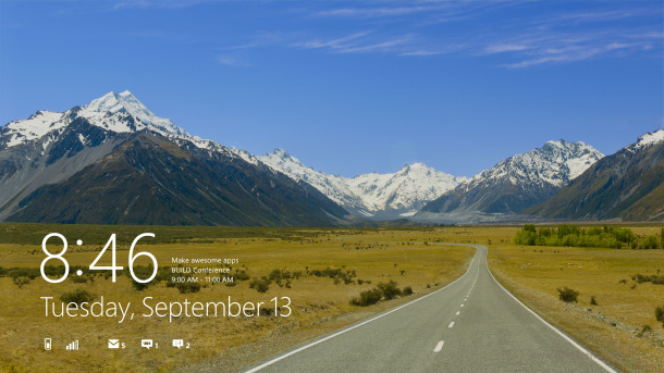
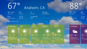
This first public build is a developer’s preview alright, there are a lot of bugs and stuff but that’s understandable. What got me excited however is the integration of the Metro-style UI right into the OS complete with buttery smooth transitions and excellent animations. It feels so unlike the Windows I’m used to.
The new, tablet-optimized Metro UI is a substantial part of the new Windows 8. The system boots straight into the Metro UI by default, your well-known Desktop is nowhere in sight. Now, relax, it’s there and it’s easily accessible and I bet Microsoft will add a switch for that. But I digress.
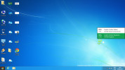
My goal is not to do a full review of Windows 8, I just wanted to let you in on some of the little changes that I stumbled along the way. Luckily or not, I still haven’t encountered a Blue Screen of Death but I had the feeling we were going to be surprised here. Well, fellow journalists have already made a big deal out of it and yes, it’s nice to see it finally updated and sounding more… human-like. Unfortunately, it still won’t tell you what exactly caused the system to crash.
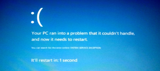
The new BSOD
Windows 8 comes with a few new shortcuts too, one of them taken straight from the Mac OS X. I’m talking about the Win+Space combination which now changes the language. The Mac OS X one is the same (Command+Space). Other new shortcuts are Win+Q for Search, Win+Z – flip open applications, Win+Y – show desktop, etc. For a list of all new global hotkeys, visit this link.
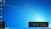
A major change in Windows 8 is that there’s no longer a Start menu as you know it. There’s still that Start button on the taskbar. If you just hover it with the mouse you’ll get a HUGE on-screen clock, date and system indicators (Battery, Wi-Fi). Nice… You also get a small menu with some options.
Clicking on the Start button, takes you up to the Metro UI.
You can reclaim the old Start Menu by a registry tweak but the downside is you get the old Task manager and the old File Explorer. Here’s a link that will show you how to change this, if you really insist.
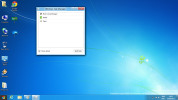
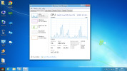
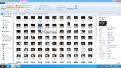
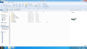
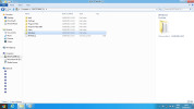
The new File Explorer and the updated Task Manager are two of the key changes we see compared to Windows 7 so I’m quite fond of those. Both offer a wealth of new options and more information.
At first look it might occur to you that Microsoft simply pasted the Windows Phone 7 UI on top Windows 7, but it’s more than this. They’ve made the Windows tablet-friendly without all those complex interfaces and menus, but they didn’t leave them out either. In the end of the day, it’s just another Windows, it’s not a major change, it’s simply improved and more flexible.
So, Windows 8 holds lots of surprises. Surely it has a lot of things to be fixed, developed or completely rewritten. But it is going to be something pretty and something fast when it finally makes it out the door. And that’s always a good thing.
Featured
Categories
- Mobile phones
- Mobile software
- Mobile computers
- Rumors
- Fun stuff
- Various
- Android
- Desktop software
- Featured
- Misc gadgets
- Gaming
- Digital cameras
- Tablets
- iOS
- Desktop computers
- Windows Phone
- GSMArena
com - Online Services
- Mobile Services
- Smart Watches
- Battery tests
- BlackBerry
- Social Networks
- Web Browsers
- Portable Players
- Network Operators
- CDMA
- Windows
- Headphones
- Hands-on

 Lenovo A7000 Preview
 HTC One E9+ performance benchmarks
 HTC One M9+ preview
 Samsung Galaxy S6 updated to Android 5.1.1: exploring the differences on video
 Xiaomi Mi 4i battery life test
Comments
Rules for posting